
Annex for O’Neil Software

Summary
An online shopping and service experience
Since 1981, Annex has provided clients with convenient access to secure document storage solutions. Partnering with storage facilities offering climate control and other amenities, Annex connects clients with suitable options based on location and services provided. Furthermore, Annex offers a range of storage products tailored for document storage needs.
Our high-level goals were:
Make these steps fast an easy for the customers
Give customers the control of what they want, and who they want to do business with
Build a self-serve e-commerce site
During the discovery phase of the project, the client consulted with our “Discovery Team”, who essentially created happy paths from signing up to completing the main task. This is an exercise the agency uses to understand the technologies involved, and the feasibility of the product.
My role here was to:
Identify personas: for Annex, there are two types of personas discovered: Storage facility managers, and, their customers, who are companies in need of document storage.
Storage facility managers: can be management or owner of climate-controlled storage facilities that specialize in storing documentation and other important materials containing data, such as computer disks and media.
Clients: companies that generally handle large amounts of documentations, some clients in this field are law offices, real estate companies, government, medical facilities, etc.
Annex Team: the internal team needed a website where users could securely find, and sign up for document storing facilities, but also include content, company information, and all the tools a cms would have.
2. Develop User Flows: we created initial user flows during the discovery process, that I simplified when we created the user personas, by finding the cross between technology and user needs.
3. CMS Design: because we were using Directus for the content, I designed several content containers so that the team could mix and match as they identified content pages and sections they needed to grow their website.
4. E-commerce flow: because the user finds, selects and signs up for service through the website, we created a completely custom shopping cart where users can shop for storage supplies, along with locating storage facilities that meet their needs, as well as sign up for their services and schedule leases.
Kickoff
The Annex team has been managing this process manually since the 1980s, drawing from a wealth of insights and subject-matter expertise whenever questions arose. To streamline our collaboration and development process, we initiated Rapid Iteration Meetings with the client. These sessions, lasting approximately two hours, were held three times a week over a period of three weeks. During these meetings, we engaged in discussions about workflow, brainstormed ideas on whiteboards, and updated the Figma file in real-time with client input. The following day, we refined and polished the designs, revisiting them as necessary to ensure accuracy in capturing the workflow.
Steps the user would follow:
Visit Annex.com
As users are still exploring and discovering Annex's services, we provide comprehensive information about our offerings and products. Additionally, we guide users through their transactions to educate them on the process for future reference.
We intentionally allow for the user to select a location and items or click “Get Started” without any dependencies.
Marketing Side
This platform is essentially a hybrid of a marketing website with an e-commerce platform, so it’s important to represent both properly.
For content pages, we prioritized providing the Annex team with a CMS experience, enabling them to edit and update pages easily, akin to a marketing website.
So I designed several customizable containers, so that the team could mix and match as needed, in addition to fully designed V1 pages.
Shopping Side
To enhance the user's shopping experience and facilitate agreement to terms of service, I developed a drawer cart that expands to the width of the screen. This design feature provides ample space for users to review terms of service while focusing solely on their transaction, without distraction from the rest of the site.
Discovery
Prior to diving into the design phase, we conducted multiple workshops with the Annex team, fostering excellent collaboration. Their ability to seamlessly incorporate input from various stakeholders, including development, marketing, and adoption, ensured that all perspectives and needs were heard. Leveraging this feedback, we were able to propose solutions tailored to their requirements.
This approach resonated with both teams, given Annex's extensive industry experience. Together, we agreed that our initial approach to Annex would rely on subject matter expertise, with plans to iterate to V2 and beyond based on user experience feedback.
An Improved Experience
Now, after peeling back all of the manual work, we have a simplified user flow where the end-user has control over the process, and streamlines everything that used to be clunky and time consuming.

Beautiful Displays
While the team came in with branding materials, some of the colors were not accessible, so we expanded the color library to include shades that could pass ADA standards. We also opted to use some of the colors for the type of cta

MLP
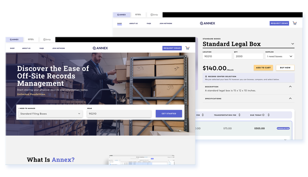
End Users can specify location and purchase supplies
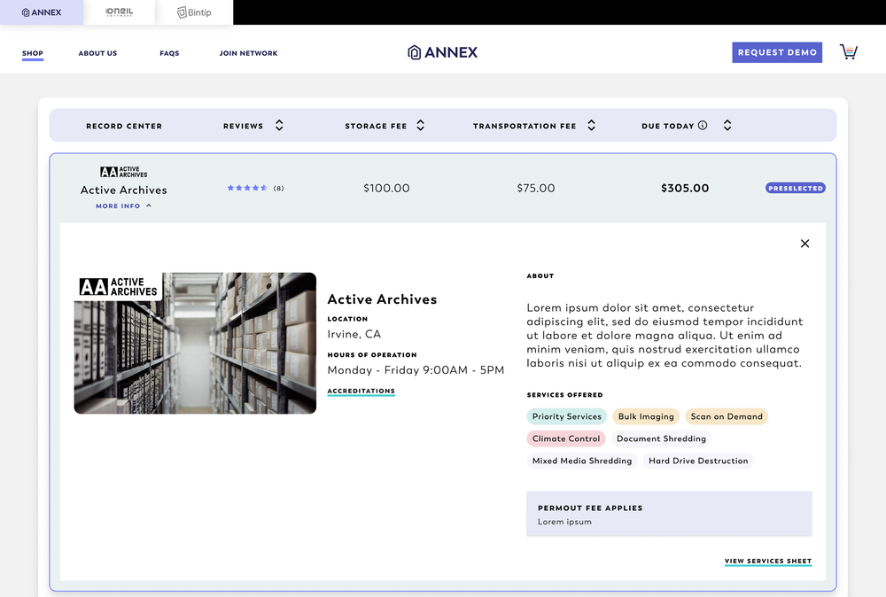
Can select and sign up for storage service
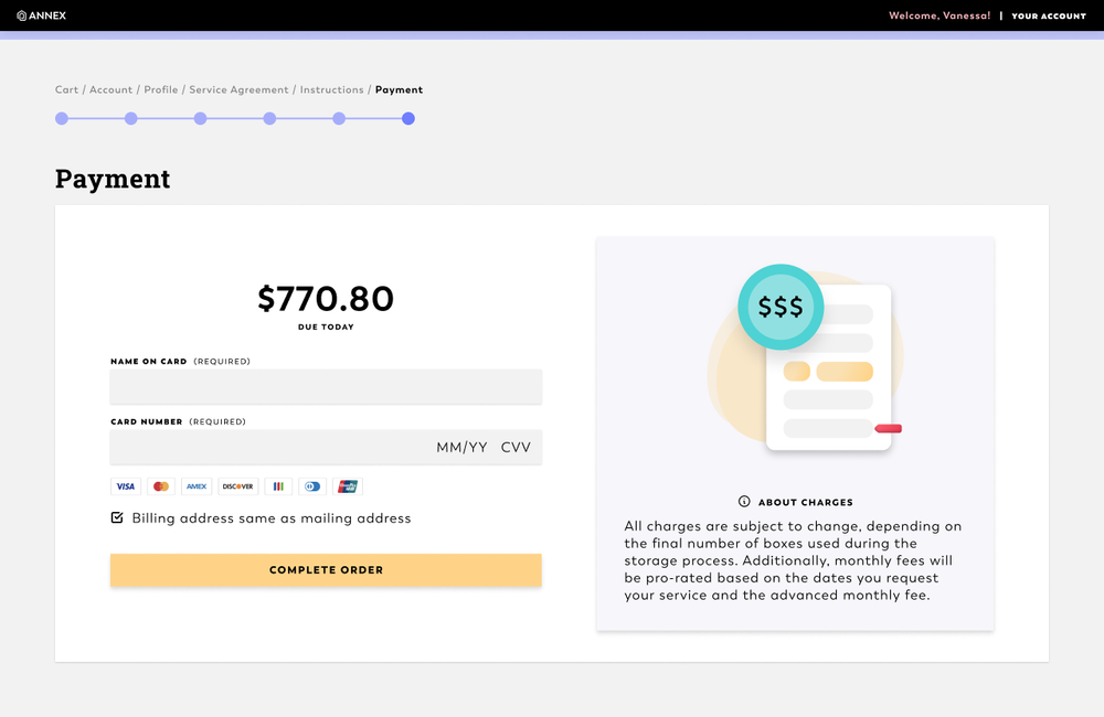
Can check out and schedule services
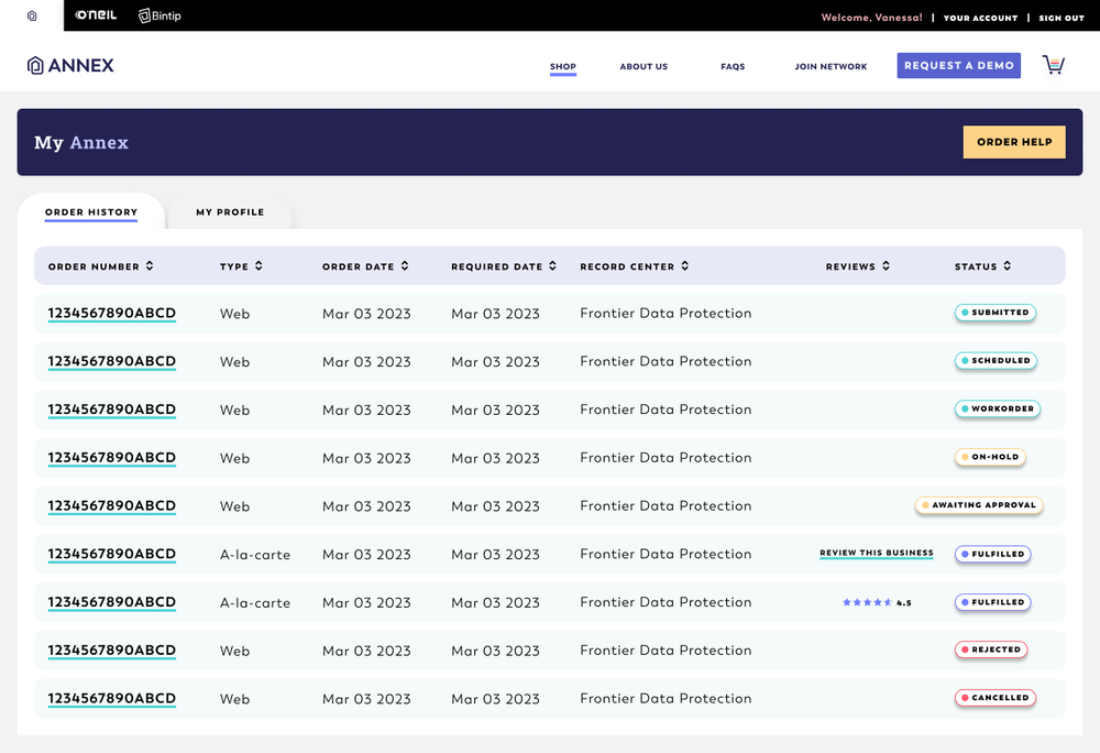
Can manage their account
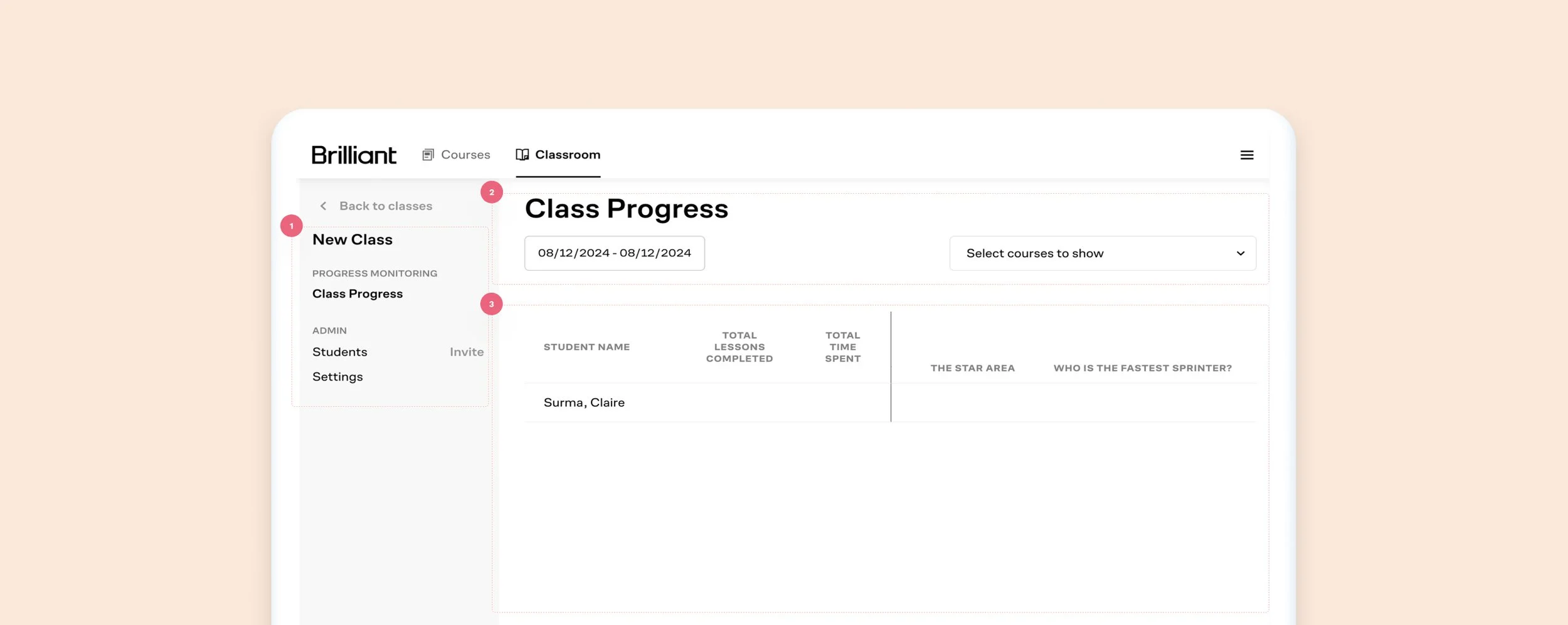
Old Class Progress Screen
What worked: Educators can review each student’s progress, invite students, and change settings.
What did not work:
The lack of color contrast between ctas, links, and labels can be confusing to the user
Misaligned items, a lot of unused space, no direction
Unclear information, wasted space, confusing UI
Kickoff
The Annex team has been managing this process manually since the 1980s, drawing from a wealth of insights and subject-matter expertise whenever questions arose. To streamline our collaboration and development process, we initiated Rapid Iteration Meetings with the client. These sessions, lasting approximately two hours, were held three times a week over a period of three weeks. During these meetings, we engaged in discussions about workflow, brainstormed ideas on whiteboards, and updated the Figma file in real-time with client input. The following day, we refined and polished the designs, revisiting them as necessary to ensure accuracy in capturing the workflow.
Steps the user would follow:
View fullsize
Visit Annex.com
As users are still exploring and discovering Annex's services, we provide comprehensive information about our offerings and products. Additionally, we guide users through their transactions to educate them on the process for future reference.
We intentionally allow for the user to select a location and items or click “Get Started” without any dependencies.
View fullsize
Marketing Side
This platform is essentially a hybrid of a marketing website with an e-commerce platform, so it’s important to represent both properly.
For content pages, we prioritized providing the Annex team with a CMS experience, enabling them to edit and update pages easily, akin to a marketing website.
So I designed several customizable containers, so that the team could mix and match as needed, in addition to fully designed V1 pages.
View fullsize
Shopping Side
To enhance the user's shopping experience and facilitate agreement to terms of service, I developed a drawer cart that expands to the width of the screen. This design feature provides ample space for users to review terms of service while focusing solely on their transaction, without distraction from the rest of the site.
When things don’t go as planned
Ensuring clear messaging is essential when a user provides inaccurate information or encounters errors, particularly for a SaaS product in a market with minimal competition. Providing guidance throughout the user journey is crucial for enhancing the user experience and fostering trust in the platform.
View fullsize
Wrong format
When a user enters the wrong character types in a form
View fullsize
View fullsize
Empty States
Include helpful text to help the user find their path again
Charges explanation
There are several charges associated with the transaction, such as products and services. Explanation for all is readily available throughout the platform and check out flow.
View fullsize
UI Patterns
I relied on a customized user interface (UI) to aid users in understanding their current context within the system
Discovery
Prior to diving into the design phase, we conducted multiple workshops with the Annex team, fostering excellent collaboration. Their ability to seamlessly incorporate input from various stakeholders, including development, marketing, and adoption, ensured that all perspectives and needs were heard. Leveraging this feedback, we were able to propose solutions tailored to their requirements.
This approach resonated with both teams, given Annex's extensive industry experience. Together, we agreed that our initial approach to Annex would rely on subject matter expertise, with plans to iterate to V2 and beyond based on user experience feedback.
An Improved Experience
Now, after peeling back all of the manual work, we have a simplified user flow where the end-user has control over the process, and streamlines everything that used to be clunky and time consuming.
View fullsize
Beautiful Displays
While the team came in with branding materials, some of the colors were not accessible, so we expanded the color library to include shades that could pass ADA standards. We also opted to use some of the colors for the type of cta
View fullsize
MLP
In the end, we have a responsive web platform where:
View fullsize
End Users can specify location and purchase supplies
View fullsize
View fullsize
Can select and sign up for storage service
Can check out and schedule services
View fullsize
Can manage their account