

Year: 2022
Role: UX & UI Designer
Client: LifeOmic (Healthtech Company)
Overview
Chroma is a comprehensive design system developed to address the unique challenges of the healthtech industry. With stringent FedRamp security requirements and a diverse user base—including tech professionals, medical personnel, designers, and patients—LifeOmic recognized the need for a unified design language to ensure consistency, efficiency, and compliance across its digital products.
The Challenge
Inconsistency: Multiple products lacked a cohesive visual and functional language, leading to fragmented user experiences.
Redundancy: Designers often recreated similar components for different applications, wasting valuable time and resources.
Scalability Issues: As the product suite expanded, maintaining design quality and consistency became increasingly difficult.
Compliance Needs: Operating in the healthtech space required adherence to strict security and accessibility standards.


Objectives
To overcome these challenges, the Chroma Design System aimed to:
Establish a single source of truth for all design elements.
Streamline the design and development process through reusable components.
Ensure compliance with industry-specific regulations and accessibility standards.
Foster collaboration among multidisciplinary teams.

Approach
-
Collaborative Development
A multidisciplinary team of five designers collaborated to build Chroma. Regular workshops and design reviews ensured that the system met the diverse needs of all stakeholders.
-
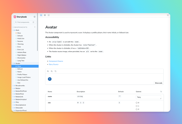
Figma + Storybook
Chosen as the primary tool for creating and maintaining the design system. It served as the central repository for library, instructions and documentation.
-
Usability Testing
New components underwent rigorous usability testing to ensure they met user needs and integrated seamlessly with existing layouts. Feedback loops allowed for continuous refinement.
-
Integration with Development
Close collaboration with developers ensured that components were not only visually consistent but also technically feasible. This partnership facilitated the smooth translation of designs into code. We leveraged tokens for this.
Key Features
Scalability: Designed to support multiple desktop and mobile applications.
Accessibility: Components were built with accessibility in mind, adhering to WCAG guidelines.
Customization: While maintaining consistency, the system allowed for flexibility to cater to specific product requirements.
Efficiency: Reusable components and standardized guidelines reduced design and development time.

Outcomes
-
Enhanced Consistency
Unified design language across all LifeOmic products.
-
Improved Efficiency
Significant reduction in design and development cycles.
-
Regulatory Compliance
Met stringent healthtech industry standards. Including FEDRAMP.
-
Team Alignment
Fostered better collaboration between design and development teams.

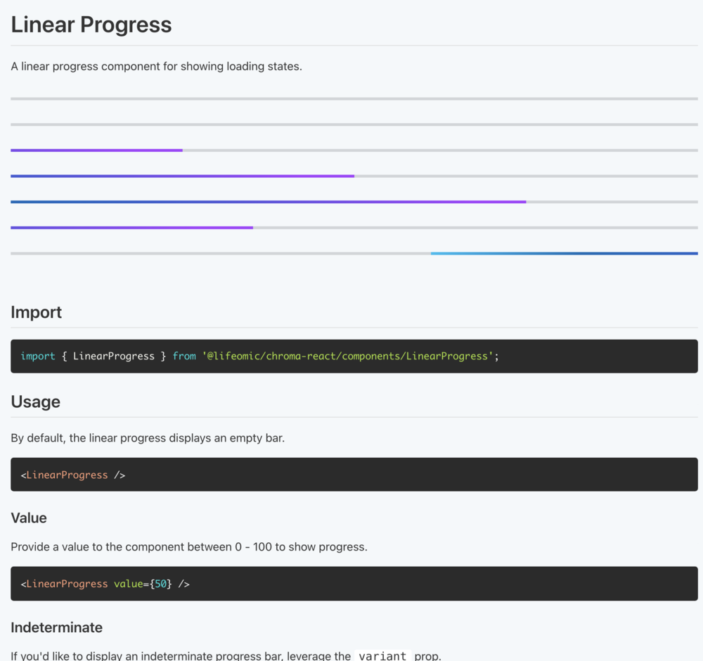
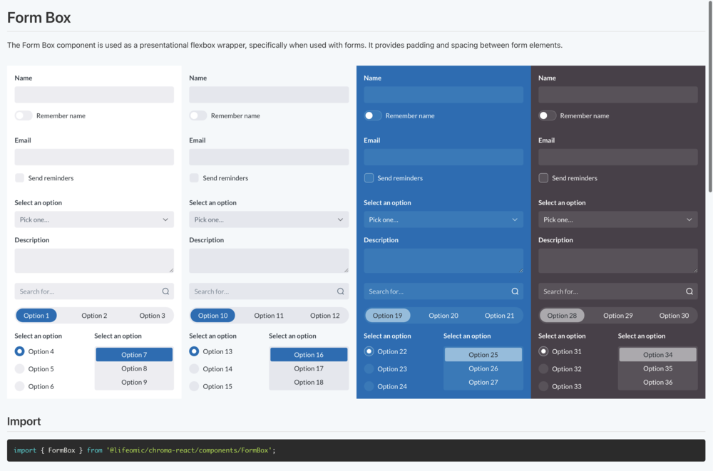
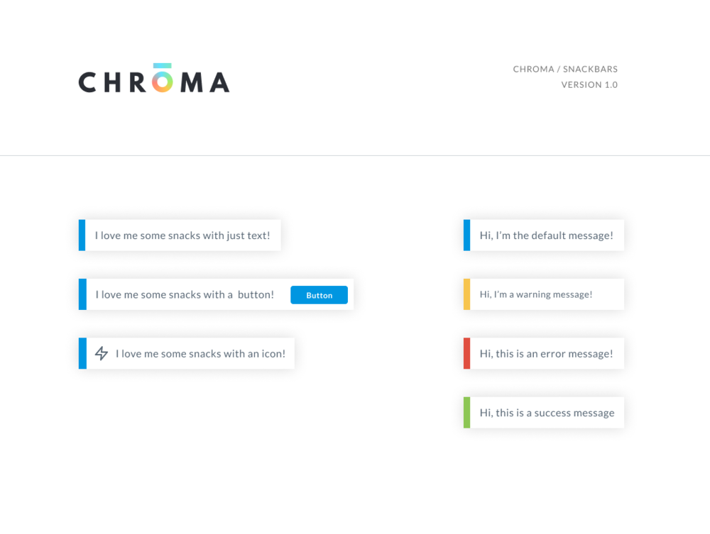
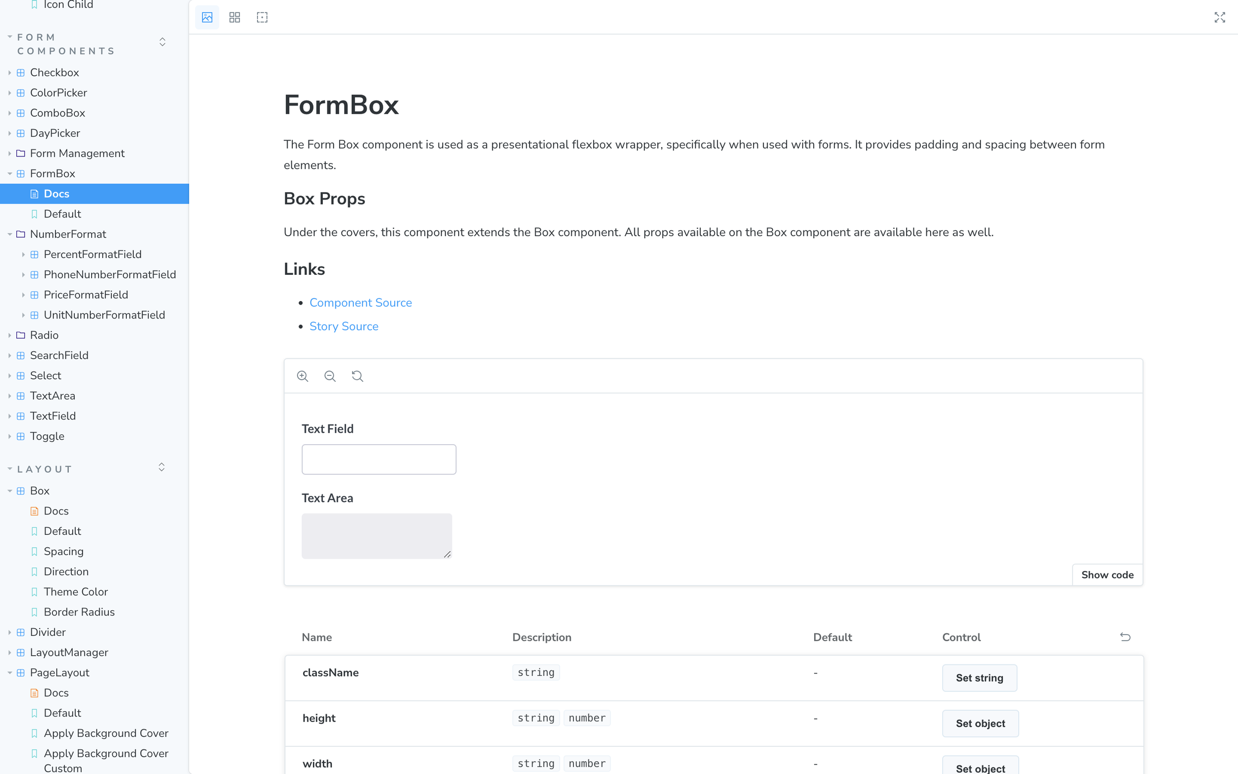
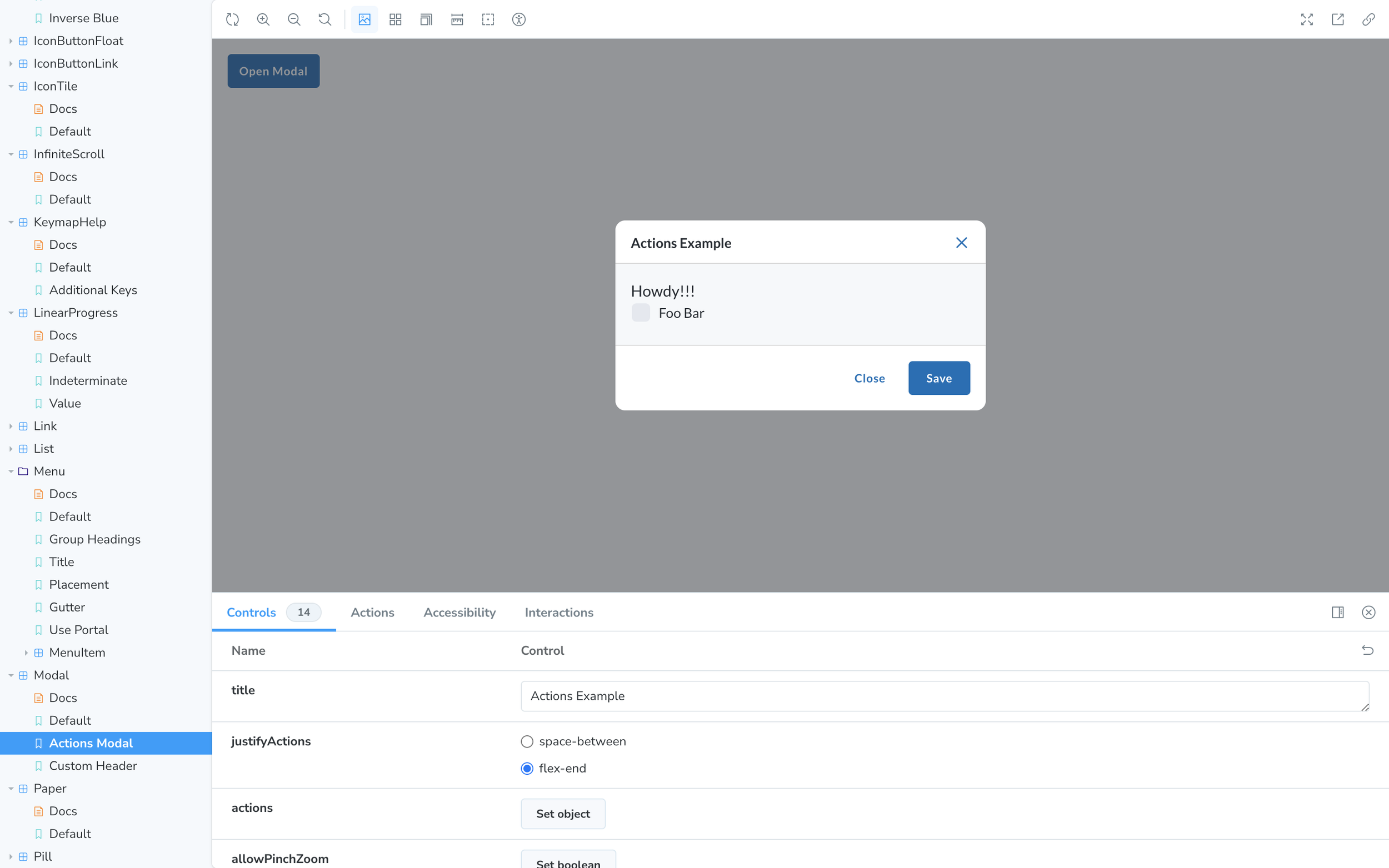

Tokens & Storybook
Including Tokens to the design was a game-changer, as it helped bridge the gap between development and design handoff.
We also went one step further, and hosted the design system in Storybook.
Let’s Talk!
I’m a designer, problem-solver, and storyteller with a love for color, whimsy, and thoughtful details. With experience in product, graphic, textile, and UX design, I create work that blends beauty with functionality. Whether designing patterns, packaging, or digital experiences, my goal is to spark joy and enhance everyday moments.