
Brilliant for Educators

Summary
My role in this project was to utilize all of the user research and discovery work the Brilliant team prepared over the course of a year, bringing my experience to distill and strategize the redesign of the already existing screens, and prepare design for new pages within the educator app.
Brilliant.org is an edtech company that caters to school-aged children, and educators. They offer free STEM courses for kids that align with school curriculums.
Brilliant has two different sides to their product: the Brilliant program for students, and the Educator portal.
Challenges
To evaluate the current app, I signed up for a free educator account with the help of the Brilliant team. I navigated the existing flow and screens independently, placing myself in the mindset of an educator accessing the platform for the first time.
My first-time user experience aligned closely with feedback the Brilliant team received from educators, highlighting several key pain points:
Progress Confusion: A lack of clear language and prompts made it difficult to understand the next steps without referring to the website.
UI Challenges: Extensive use of gray for links and important information caused usability issues.
Course Navigation: With over 100 courses (each containing 5–30 lessons), progress data needs to be displayed by student. However, the current table is a long, horizontal scroll, requiring significant time to review.
Lack of Course Information: Courses available in the app cannot be reviewed directly within the platform and must be accessed via the website.
Event Notifications: The only way to learn about events is through email announcements from the Brilliant team.
User Flows
The Brilliant team collaborated with their development team to prepare user flows and provided excellent suggestions that required only minor adjustments based on best practices or additional context.
For instance, regarding messaging, my initial assumption was that there would be a system for direct communication between Brilliant and educators. However, implementing such a feature would require significant development and discovery time, which fell outside the project’s scope. Instead, the optimal solution was to enable the Brilliant team to display banners within the portal for their announcements, streamlining communication without extending the timeline.

One of the ways we communicated user flows was through the use of Notion. Where we wrote down the experience and collaborated as a team to align. Content blurred to protect proprietary material.
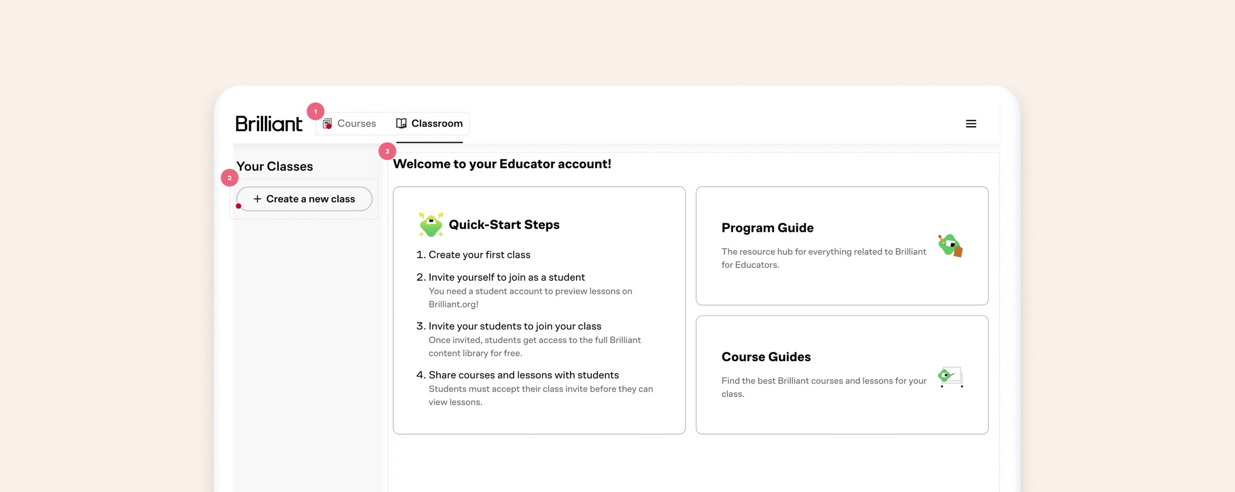
Old Dashboard
What worked: Educators can visit the dashboard and find their way to create new groups (classes), review their class and student progress, and browse through the hundreds of courses available through Brilliant.
What did not work:
Usability and accessibility issues: the home page is the second tab, which causes navigating confusion. Additionally, inactive tabs appear disabled due to the UI treatment.
Lack of focus: while there is content explaining next steps to the user, it’s unclear what is expected of them by having grey buttons on the side of the screen vs providing it more visual hierarchy.
Welcome and quick steps: take up the majority of the screen, giving the appearance that is the most important part of the screen.
New Dashboard
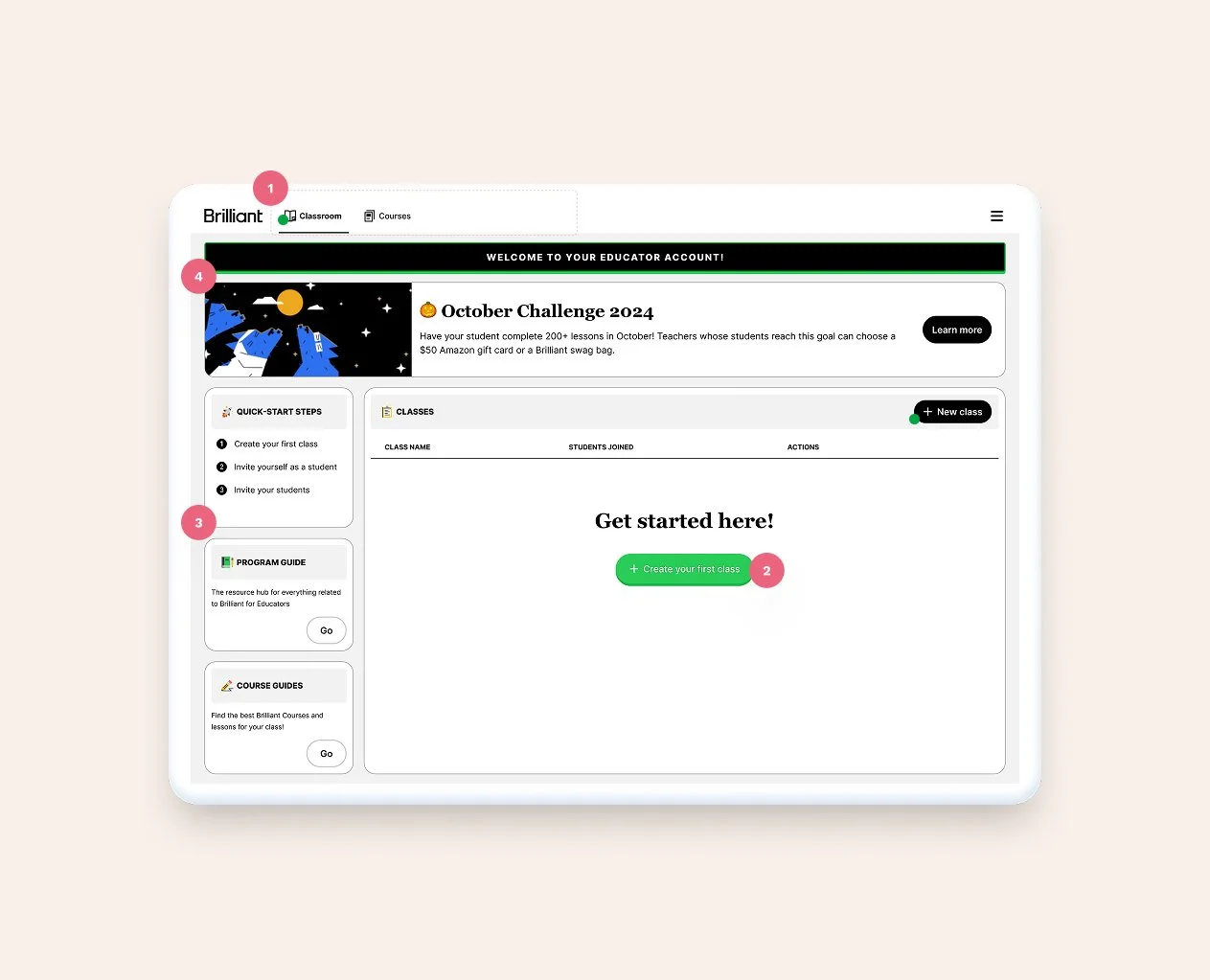
1. Updated tabs to follow the actual user flow + updated UI to avoid accessibility issues.
2. Added clarity to actions by moving CTAs strategically
3. Moved next steps and content to the left-hand side to give way to actions
4. Added a banner to the page to enhance Brilliant's communication with their users
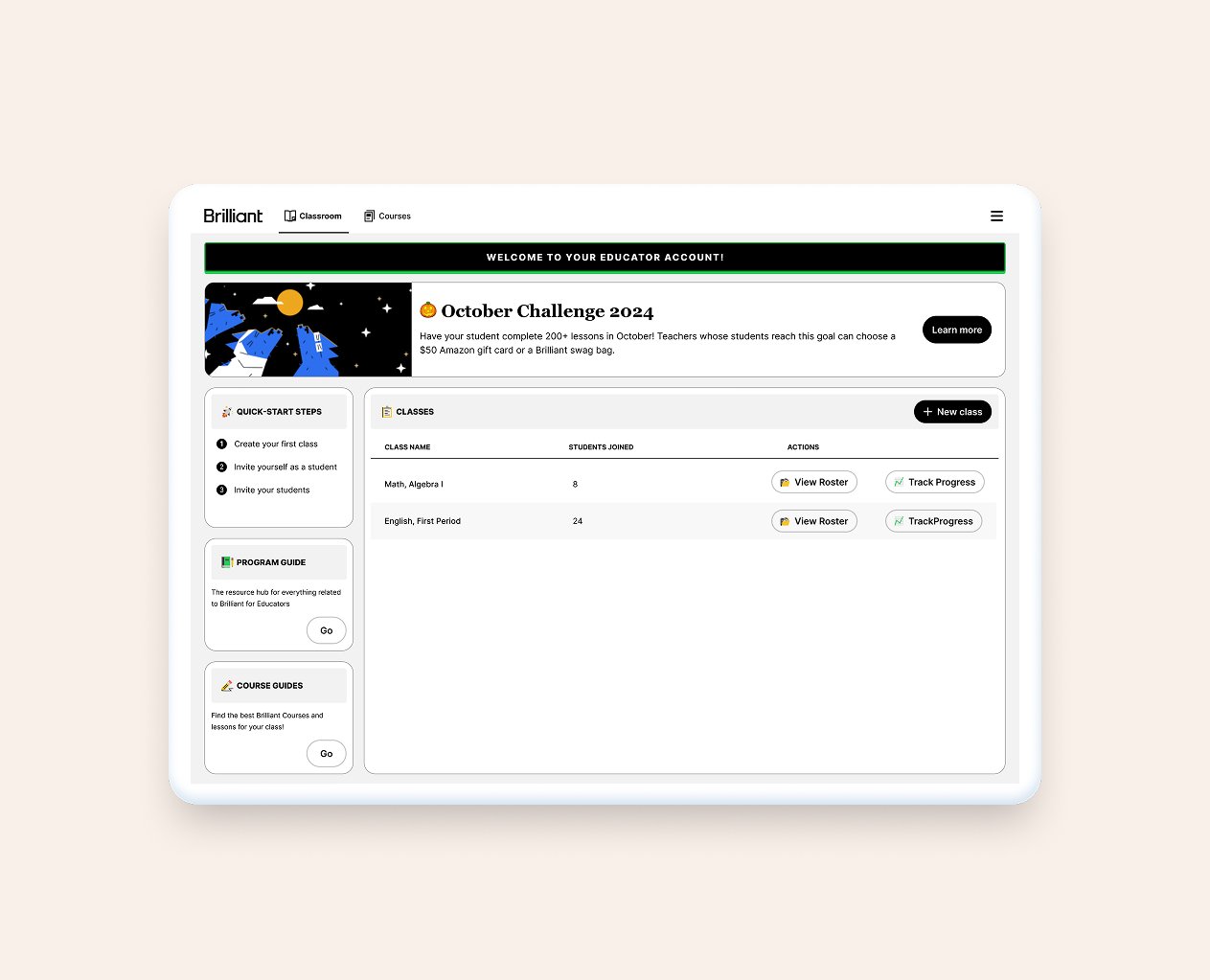
Once the user creates their first class, the green button disappears and the space turns into a table. In the future, there is also opportunity for adding stats to the screen.
Old Class Progress Screen
What worked: Educators can review each student’s progress, invite students, and change settings.
What did not work:
The lack of color contrast between ctas, links, and labels can be confusing to the user
Misaligned items, a lot of unused space, no direction
Unclear information, wasted space, confusing UI
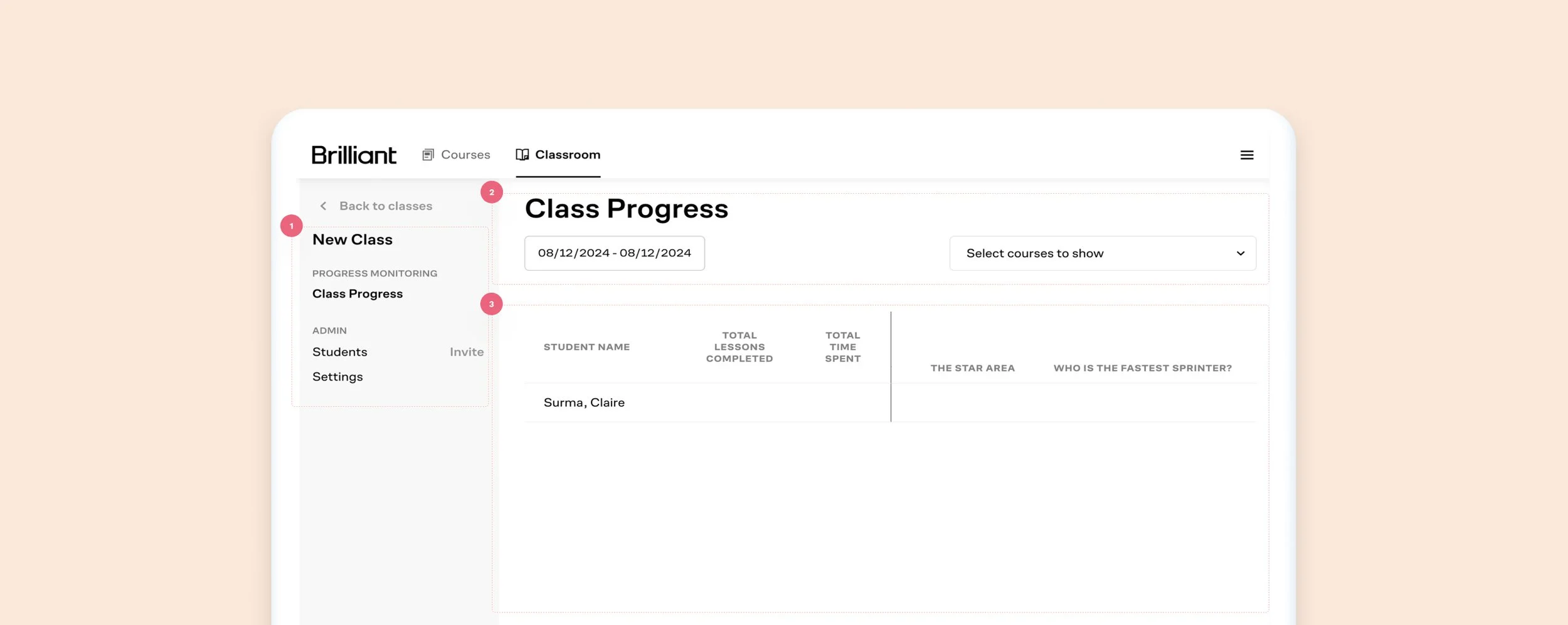
New Class Progress Screen
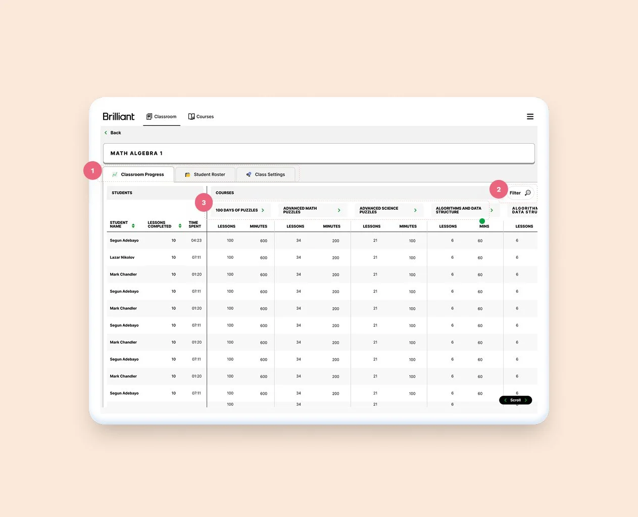
1. Breaking things into three separate tabs allow for better use of the space
2. Folded filters into it's own CTA and modal
3. Tightening up cells, and adding contrasting backgrounds between lines help the table read better
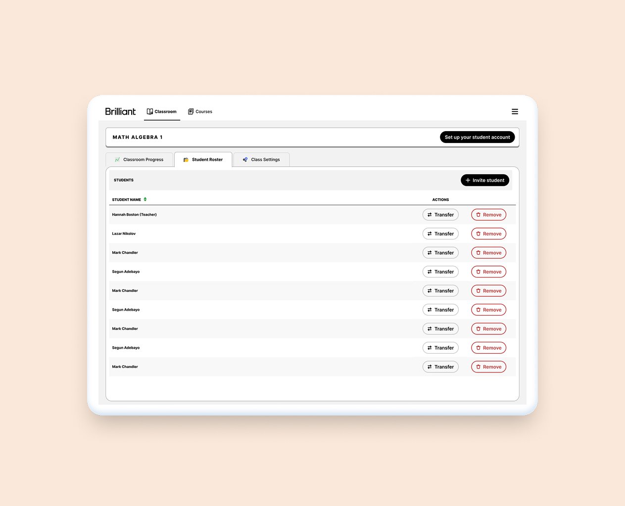
Moving the student management screen to it's own tab will allow for current and future uses
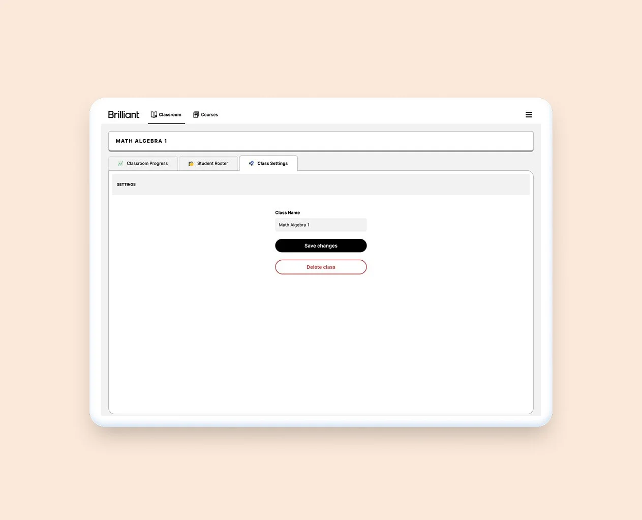
Moving the class management to it's own tab allows for a clearer experience, and space for future features