Annex for O’Neil Software
Making 40 years of records management infrastructure feel like a modern SaaS product.
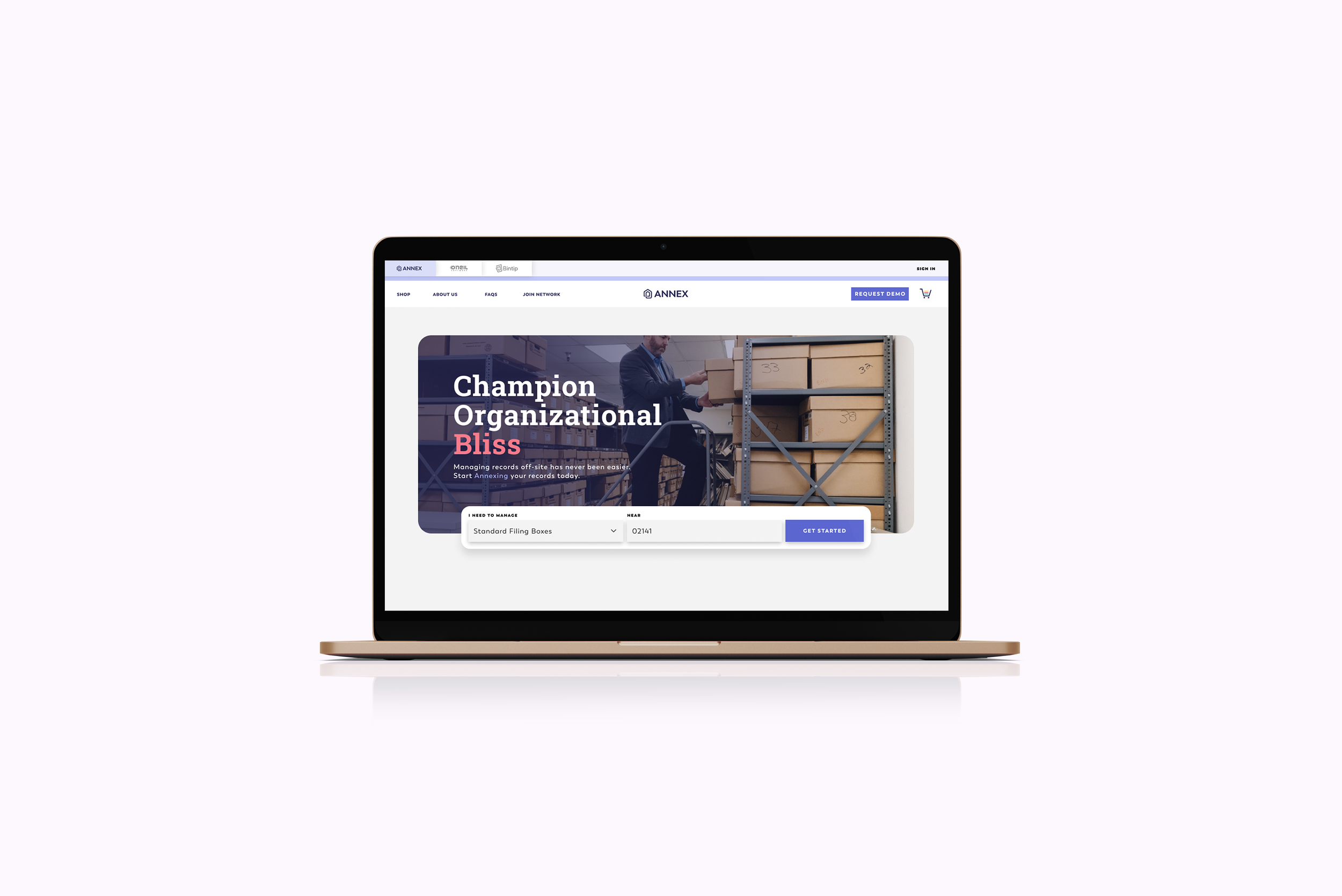
Annex Software
Intro
Annex is the digital platform built on top of O'Neil Software's 40+ years of records management infrastructure — connecting businesses to physical document storage and secure destruction services through a clean, modern interface. When I came in, the brand had accessibility issues that were undermining an otherwise serious product, and the product itself needed UX work to match the ambition of what it was trying to do.
Summary
Services: Brand Accessibility, UX Design, Product Design, Prototyping
Deliverables: Accessible color system, user flows, rapid prototypes, production-ready designs
Industry: Document Management / SaaS
Status: Live at annex.com

User
The Problem
O'Neil Software had the industry credibility and the infrastructure, what Annex needed was a visual and UX layer that made the product feel as trustworthy and capable as the company behind it.
The existing brand colors failed accessibility contrast requirements, a significant issue for a product used in enterprise and government contexts where WCAG compliance is often a procurement requirement, not a suggestion. Beyond that, the user flows needed work to make the platform's core value proposition — book document storage, compare providers, manage records — feel simple and intuitive rather than complex and corporate.
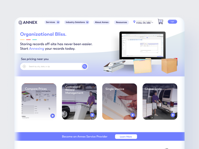
Annex, Old without WCAG Standards
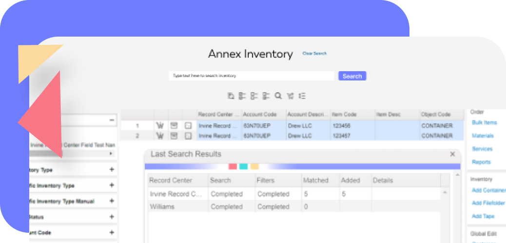
Annex, Old without WCAG Standards
The Approach
I introduced additional colors to the brand palette specifically to solve the accessibility contrast failures, not by replacing the existing brand identity, but by expanding the system in a way that gave the design team more compliant options without losing the visual consistency they'd established.
On the product side, I worked through the user flows using rapid design and prototyping, moving quickly from problem identification to testable solutions. The goal was to make the core journey (find a provider, book a service, manage your records) feel immediate and clear, not like navigating enterprise software.
Prototyping at speed meant stakeholders could see and react to real interactions rather than static screens, which compressed the feedback loop and kept the project moving efficiently.

Simplified Flow
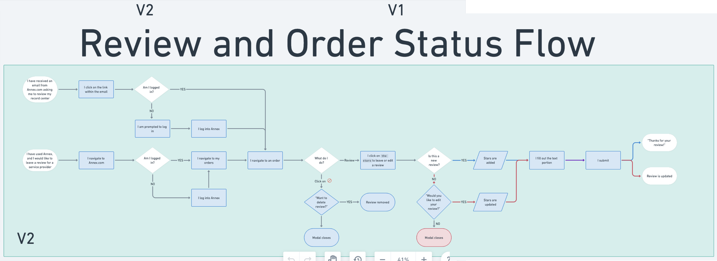
Order Status Flow
The Outcome
Annex came out of the engagement with an accessible color system that met WCAG AA standards across the platform, user flows that made the product's core value clear from first contact, and production-ready designs that the development team could build directly from.
The platform is now live at annex.com, a product that feels like what it is: modern, trustworthy software built on serious industry infrastructure, designed to be used by real businesses with real compliance requirements
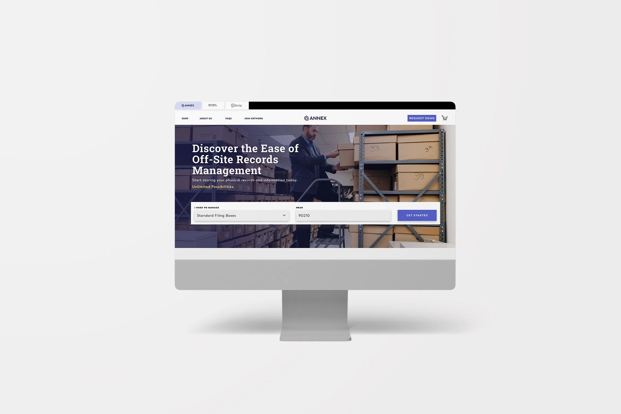
Annex
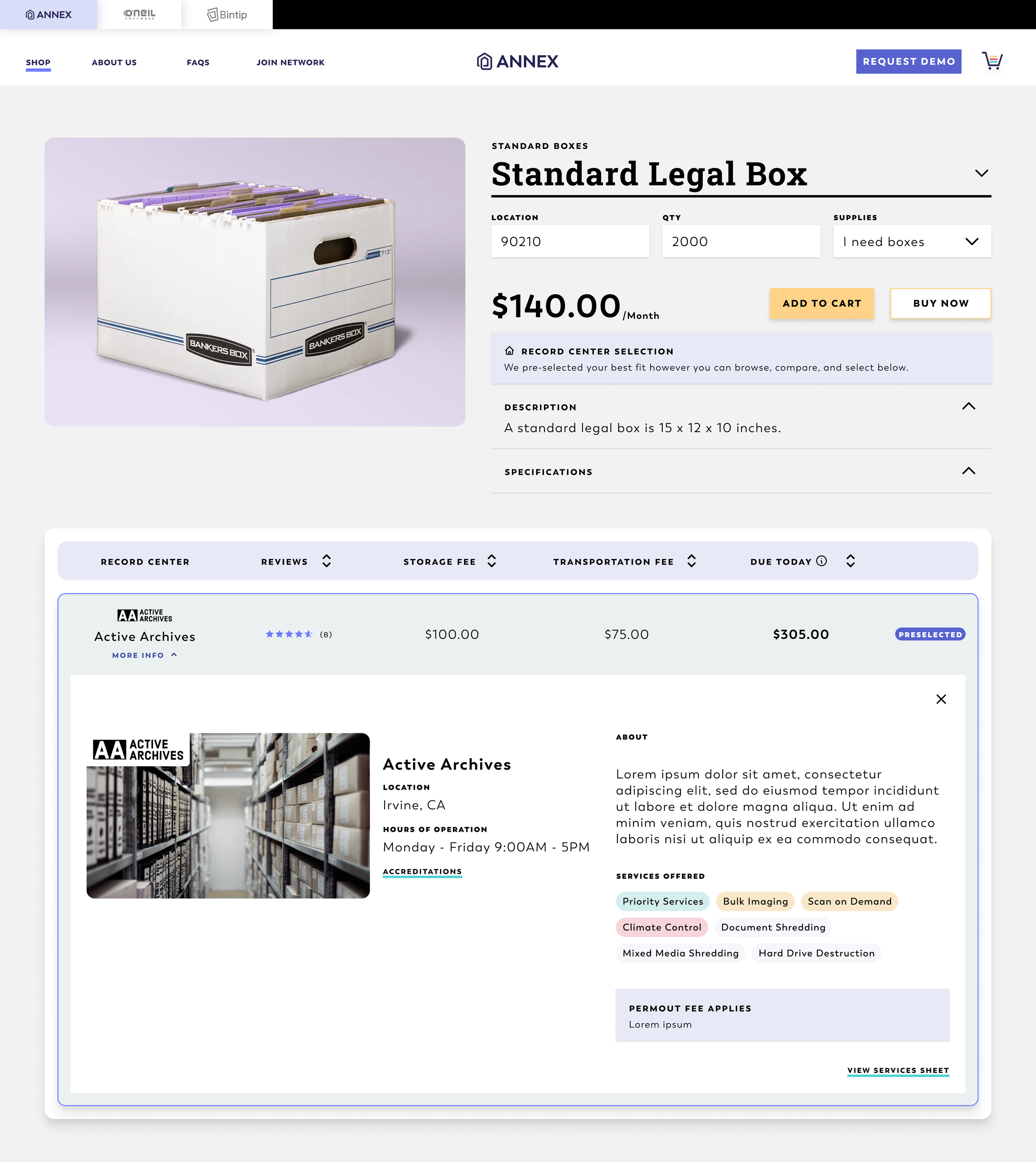
Annex, select service providers and supplies
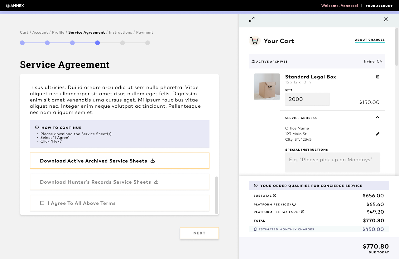
Checking out
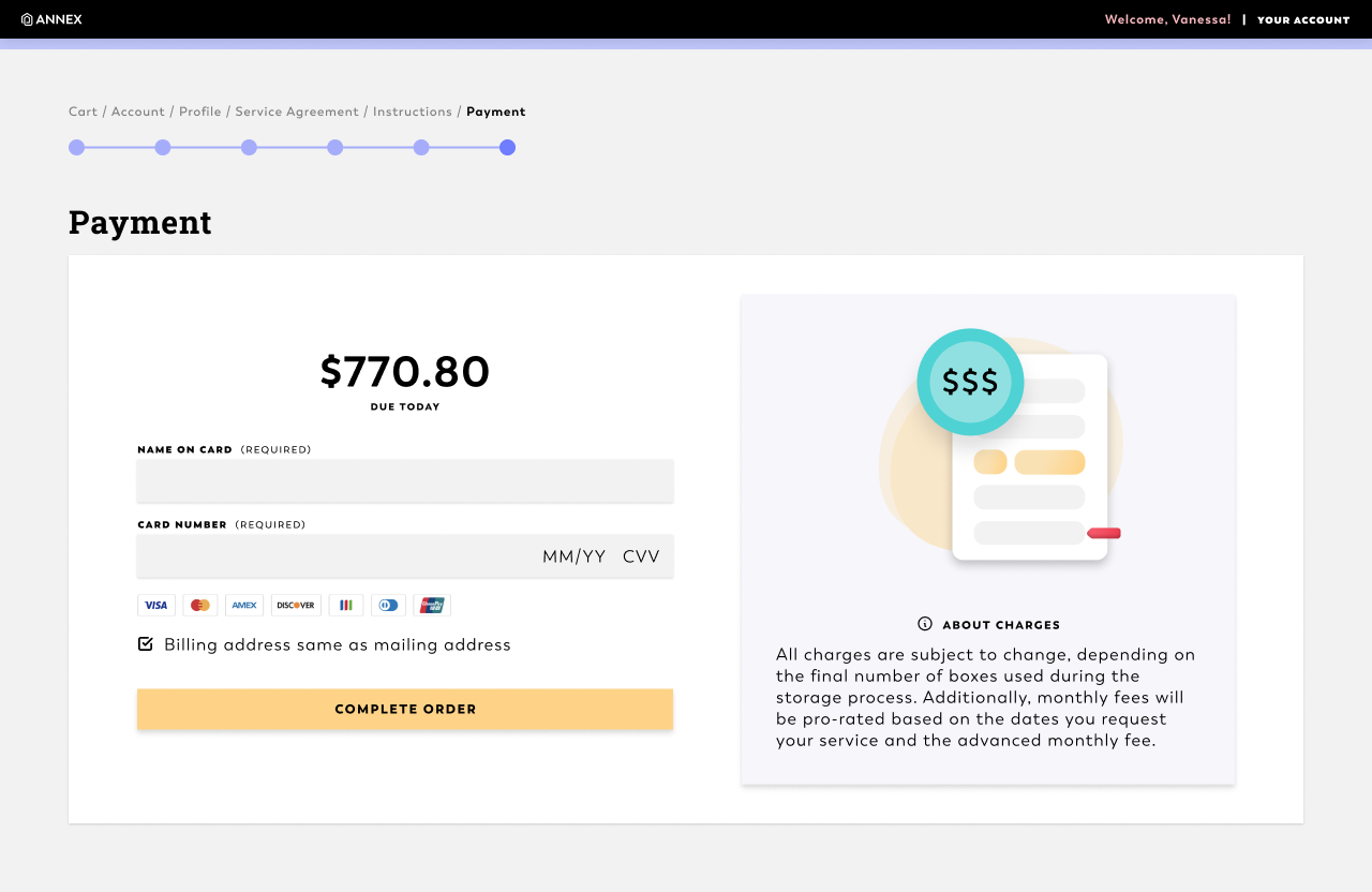
Custom Checkout
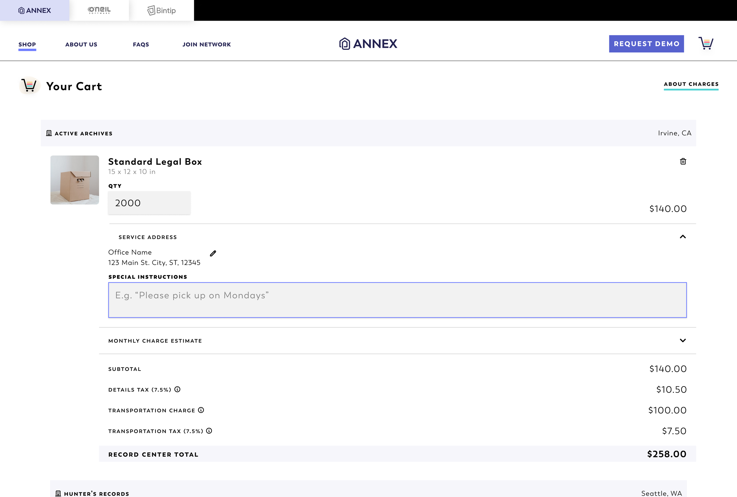
Shopping Cart
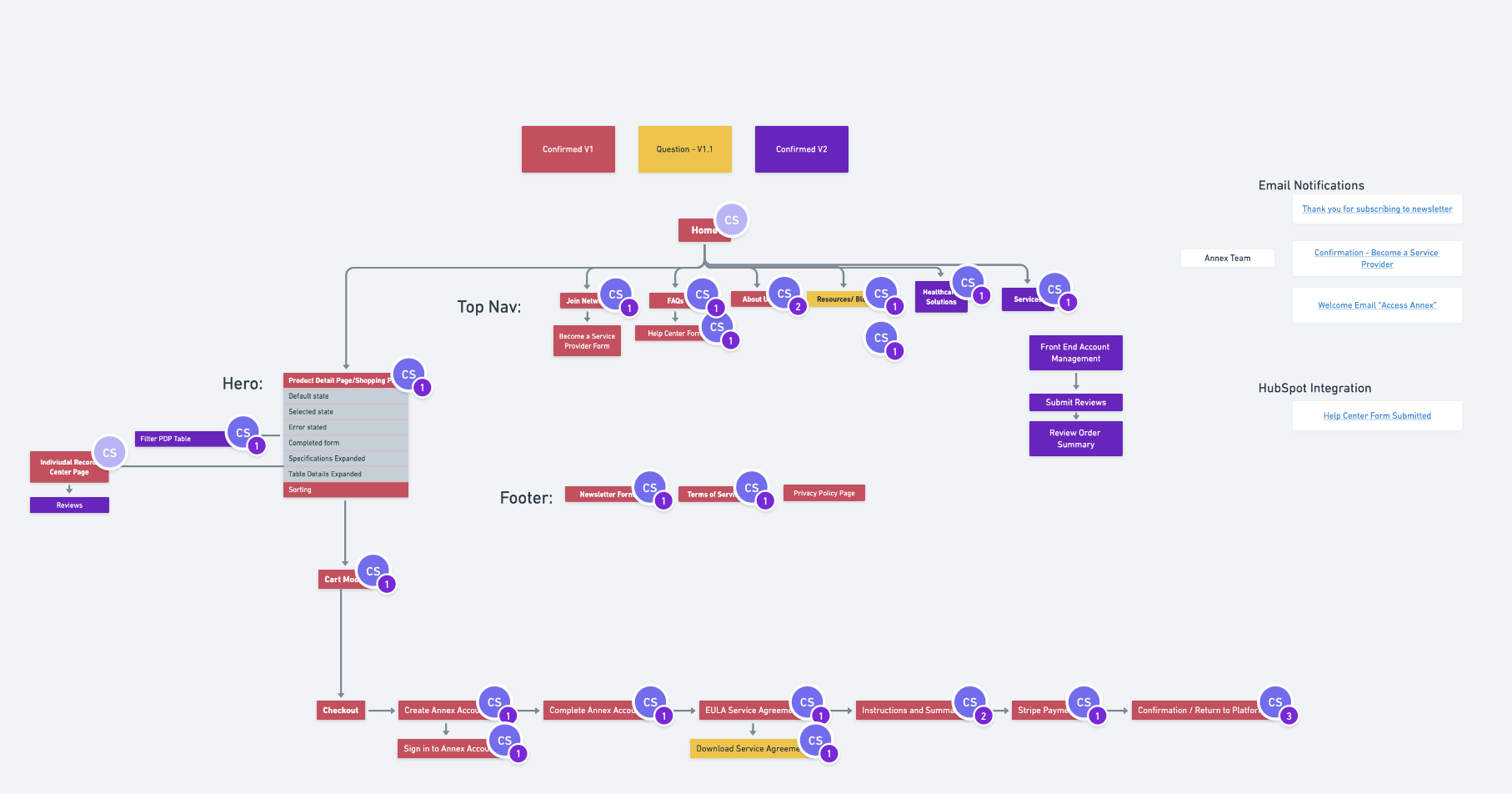
Annex Information Architecture
Stats
Accessibility fix
Brand color system expanded to meet WCAG AA contrast requirements
Rapid prototyping
User flows tested and refined through fast-cycle prototyping
Enterprise-ready
Designs built for compliance requirements in government and healthcare sectors