Brilliant for Educators
Turning a cluttered, inaccessible educator dashboard into a polished product teachers actually want to use.

Brilliant for Educators
Intro
Brilliant had built something genuinely useful for educators — a platform that gave teachers the tools and data they needed to support their students. The problem was that nobody could tell. The product was cluttered, inconsistent, and riddled with accessibility issues that made it hard to use for the very people it was designed to serve.
Services: UX Design, Accessibility Audit, Product Design
Deliverables: Redesigned user flows, clean screen designs, accessible data visualization, educator dashboard
Industry: EdTech / SaaS
Status: Live product
The Problem
When I came in, Brilliant's educator dashboard had accumulated the classic symptoms of a product built fast without a design system: screens that didn't follow a consistent logic, data presented in ways that were visually noisy rather than informative, and accessibility failures that would have disqualified it in many school district procurement processes.
Teachers are time-poor and patience-thin. If a tool doesn't make their life easier immediately, they stop using it. The design wasn't just aesthetically messy — it was actively working against adoption.
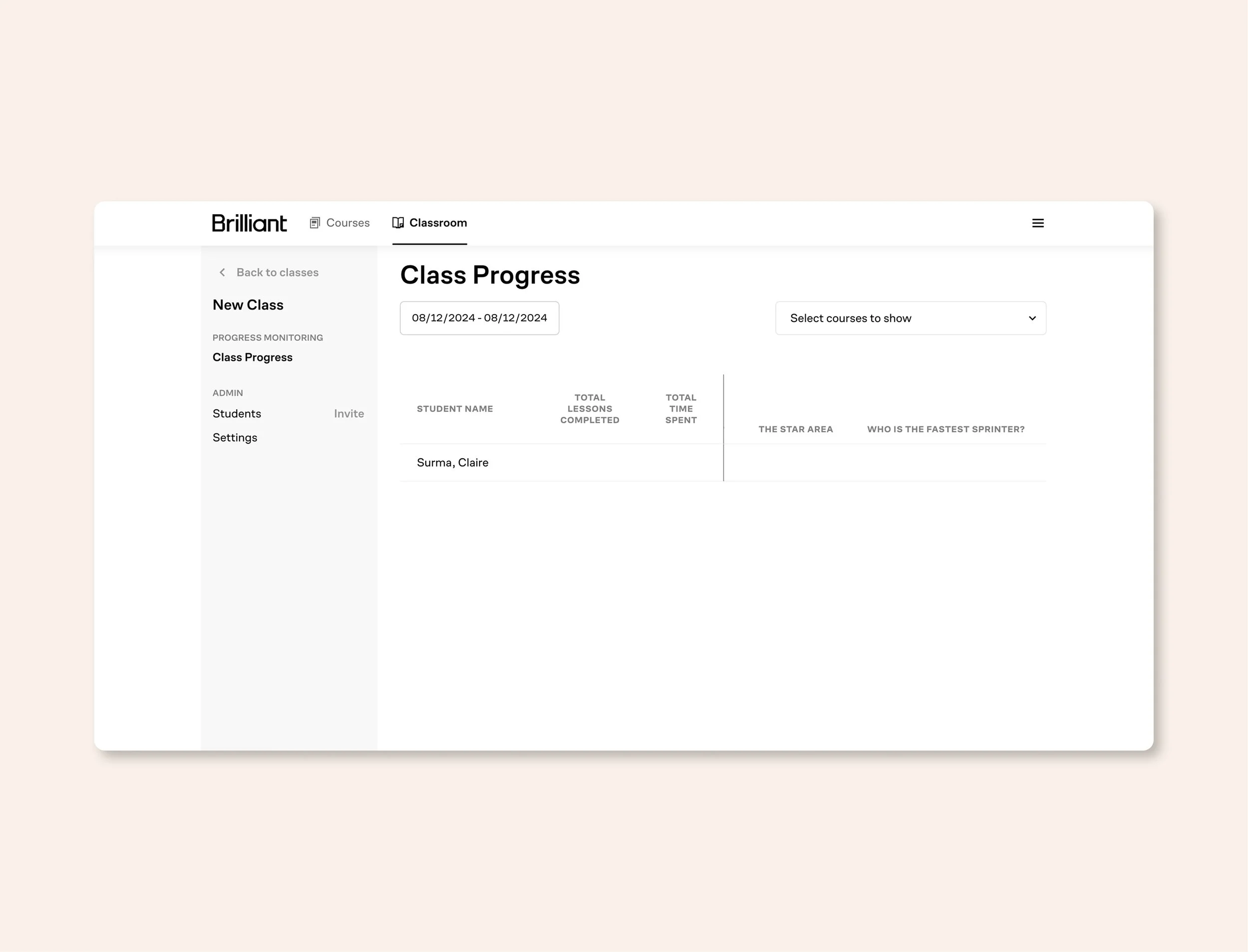
Old Brilliant Dashboard
The Approach
I started with a full UX audit — mapping every screen against WCAG AA accessibility standards and identifying where the user flow broke down. The issues were substantial: contrast failures throughout, navigation that required too many clicks to reach common tasks, data visualizations that conveyed nothing useful at a glance, and screens that mixed too many functions without clear hierarchy.
Rather than a cosmetic refresh, I rebuilt the experience from the user's perspective. What does a teacher need to see first thing when they open the dashboard? What's the most common task and how many steps does it currently take? What does this data actually mean to someone in a classroom — and how do you show it in a way that makes that clear in two seconds, not twenty?
I redesigned the user flows to reduce friction on the most common tasks, introduced a consistent visual system that scaled across the product, and found ways to represent complex data — student progress, engagement metrics, assessment results — in formats that were both visually interesting and genuinely informative.
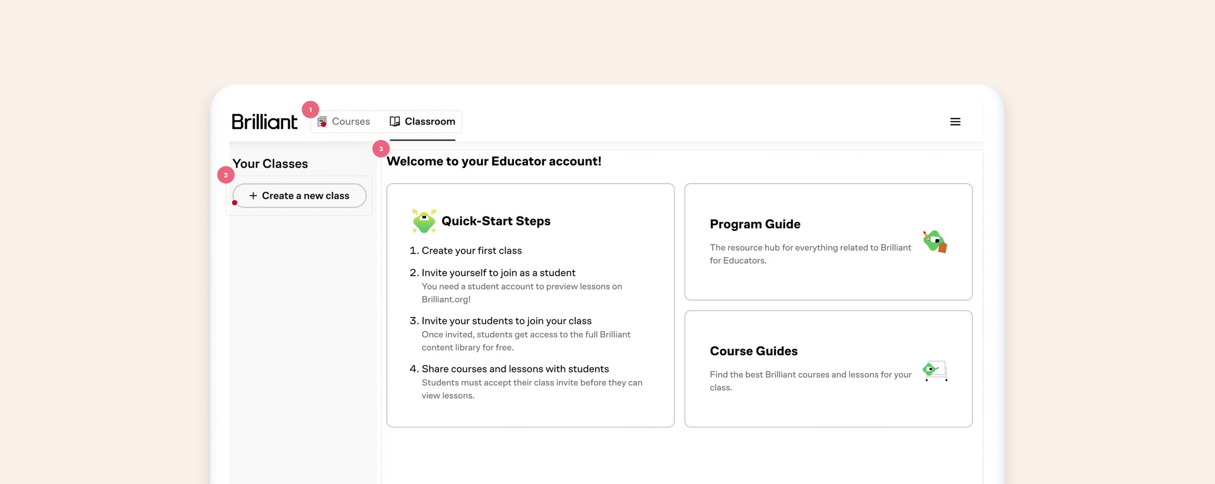
The Dashboard
What worked: Educators can visit the dashboard and find their way to create new groups (classes), review their class and student progress, and browse through the hundreds of courses available through Brilliant.
What did not work:
Usability and accessibility issues: the home page is the second tab, which causes navigating confusion. Additionally, inactive tabs appear disabled due to the UI treatment.
Lack of focus: while there is content explaining next steps to the user, it’s unclear what is expected of them by having grey buttons on the side of the screen vs providing it more visual hierarchy.
Welcome and quick steps: take up the majority of the screen, giving the appearance that is the most important part of the screen.
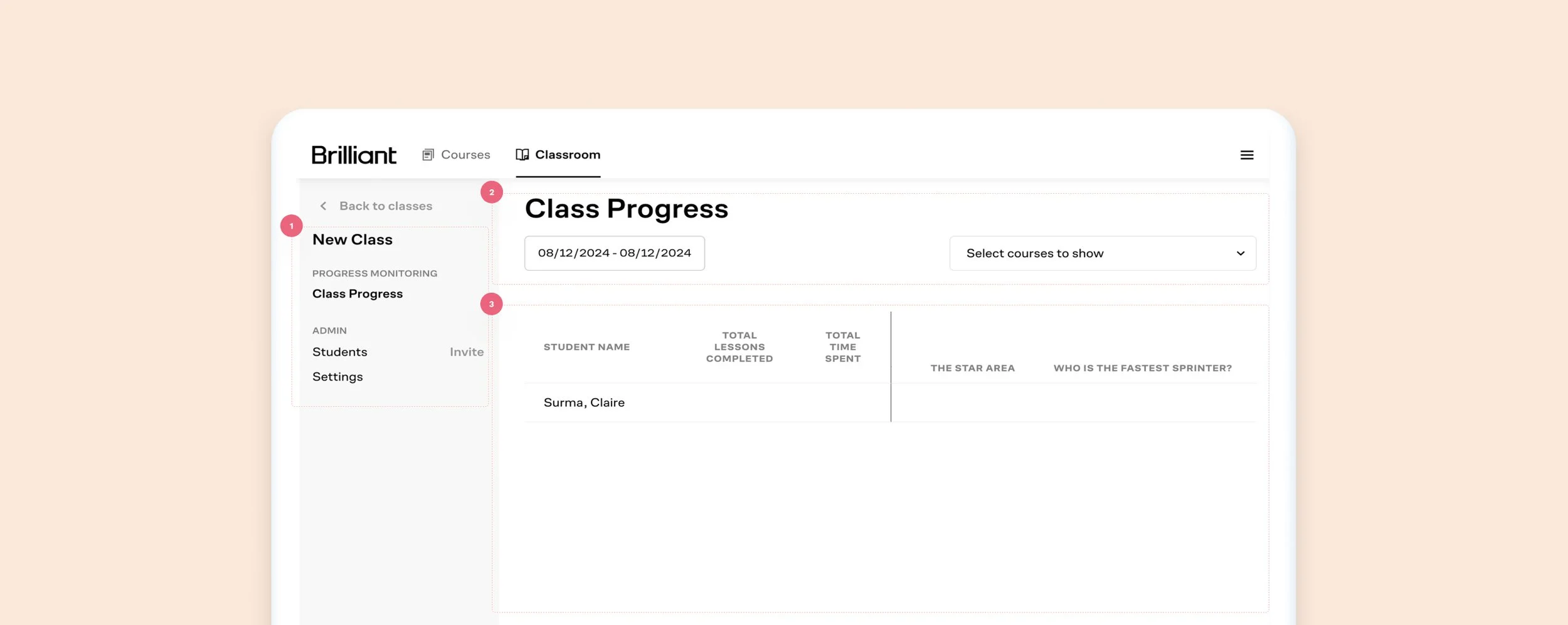
The Class Progress
What worked: Educators can review each student’s progress, invite students, and change settings.
What did not work:
The lack of color contrast between ctas, links, and labels can be confusing to the user
Misaligned items, a lot of unused space, no direction
Unclear information, wasted space, confusing UI
The Outcome
Brilliant came out of the engagement with a polished educator experience that looked and felt like a product a school district would confidently purchase and a teacher would actually enjoy using. The accessibility issues that could have been procurement blockers were resolved. The data visualizations that had been confusing were replaced with clear, thoughtful representations that communicated meaning at a glance.
The screens went from ugly and confusing to clean, purposeful, and genuinely pleasant to work in — which, for a product used by educators every day, is the difference between a tool that gets adopted and one that gets abandoned.
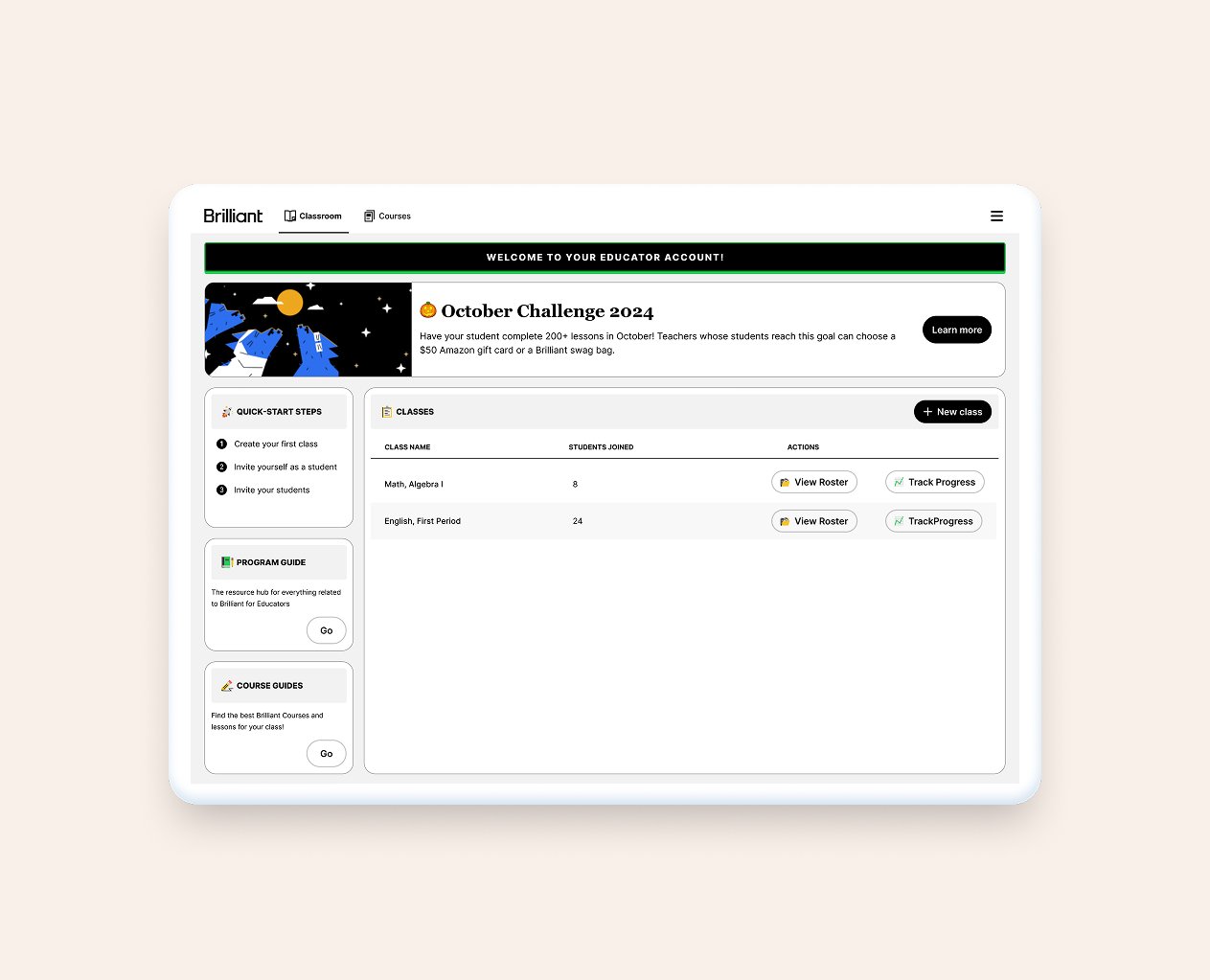
The New Dashboard
The New Dashboard
Updated tabs to follow the actual user flow + updated UI to avoid accessibility issues.
Added clarity to actions by moving CTAs strategically
Moved next steps and content to the left-hand side to give way to actions
Added a banner to the page to enhance Brilliant's communication with their users
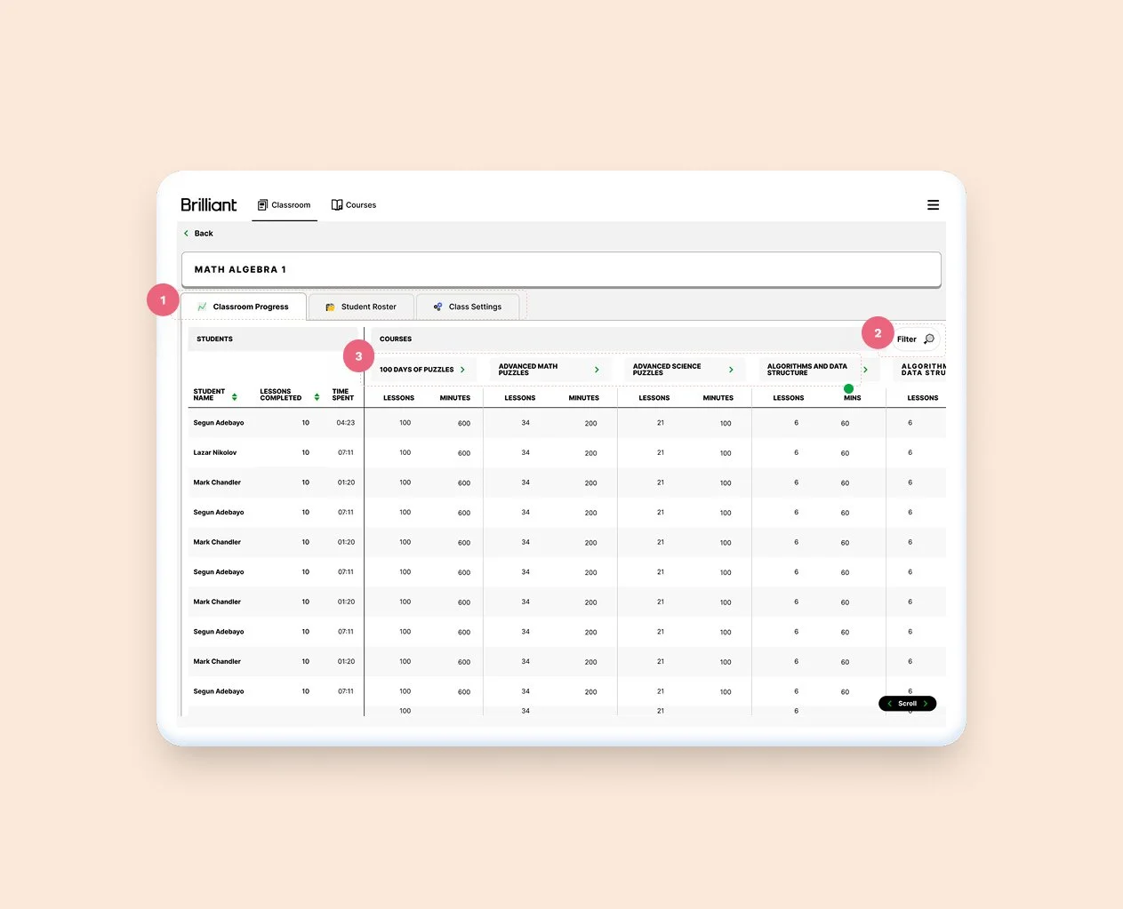
New Class Progress Page
New Class Progress Screen
Breaking things into three separate tabs allow for better use of the space
Folded filters into it's own CTA and modal
Tightening up cells, and adding contrasting backgrounds between lines help the table read better
Other pages worked on
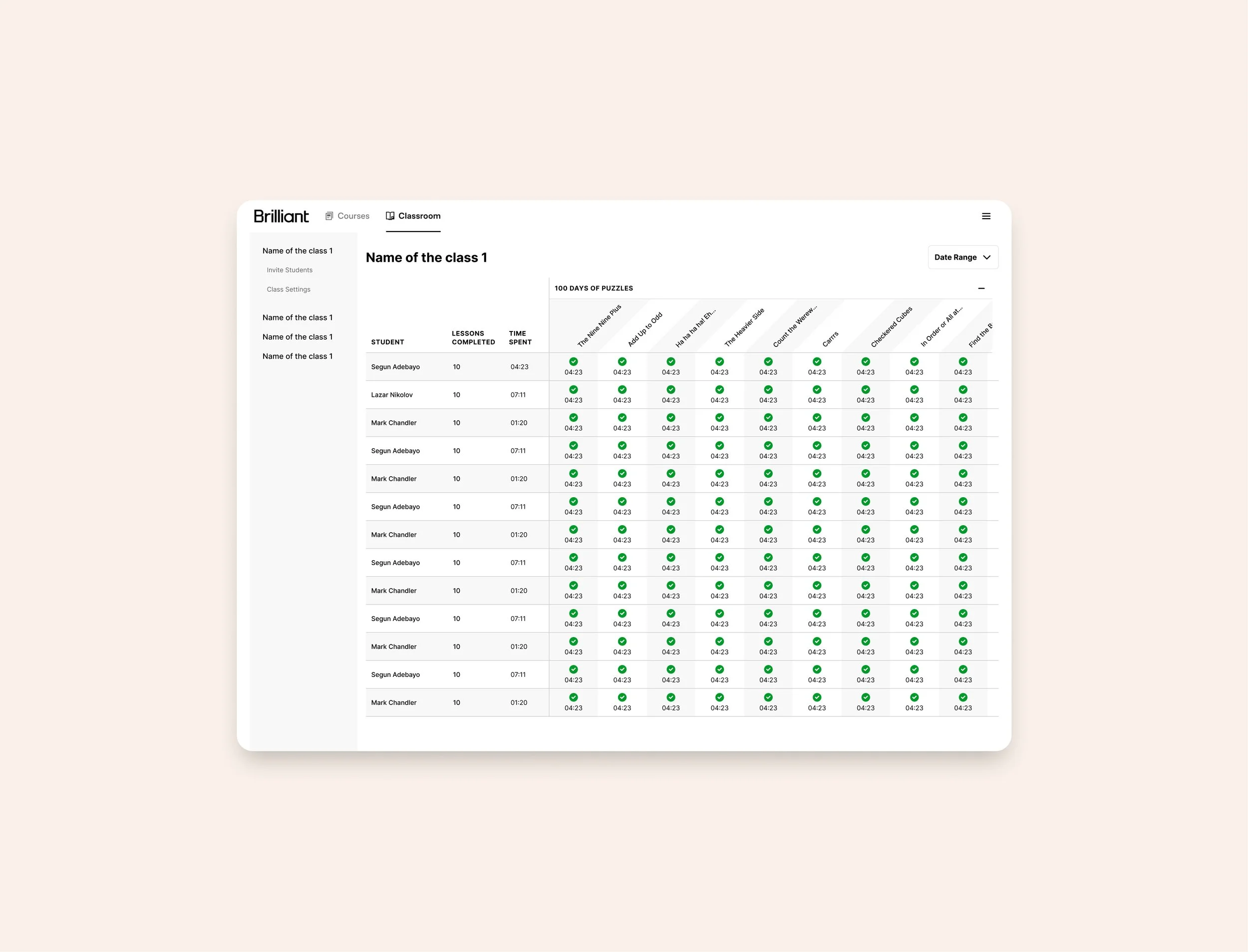
Classroom Screen

Courses Page
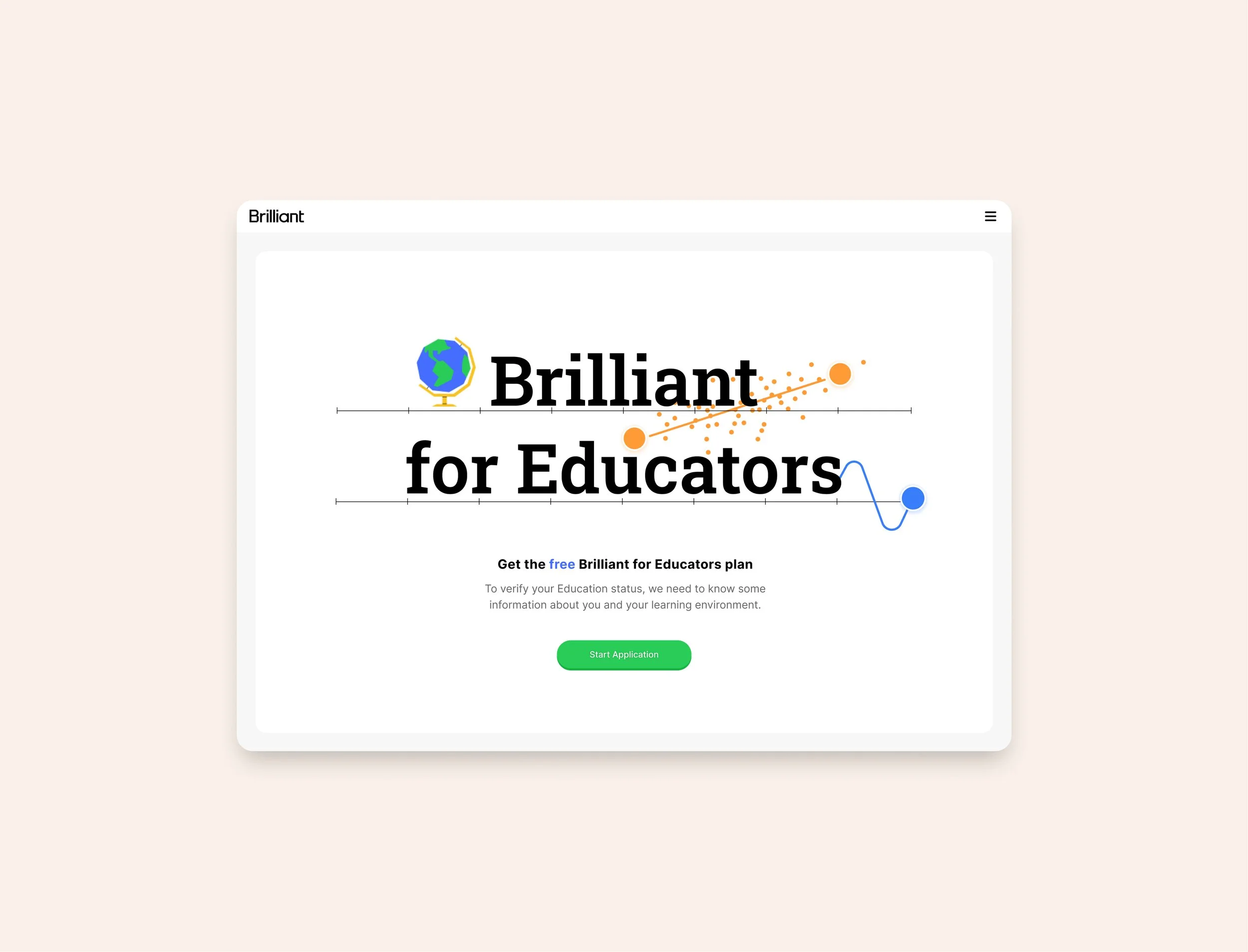
Landing Pages Illutrations
Stats
Accessibility: WCAG AA compliance achieved across the platform
UX overhaul: Complete user flow redesign for the educator dashboard
Data visualization: Complex student data redesigned for at-a-glance clarity