
Brilliant for Educators

Summary
Brilliant.org is an edtech company that caters to school-aged children, and educators. They offer free STEM courses for kids that align with school curriculums.
Brilliant has two different sides to their product: the Brilliant program for students, and the Educator portal.
My role in this project was to utilize all of the user research and discovery work the Brilliant team prepared over the course of a year, bringing my experience to distill and strategize the redesign of the already existing screens, and prepare design for new pages within the educator app.
Who.
The target user for this project is the educator. Educators are teachers within the US school system in the English language.
How.
They will use the Brilliant app during the school day from their school-assigned computers.
Why.
Brilliant helps educators teach better with a portal to manage courses, track progress, and connect with Brilliant.
Utilizing the data provided, helped me come up with a faster deliverable, as most interviews and feedback were documented and I could skip some steps for the interest of staying in scope of the project.
Next, I presented my distilled findings from all of their research, for this, I put together a document outlining how I came to these assumptions.
Educators only.
Brilliant offers a student app and serves various users like homeschoolers, tutors, college students, professors, and school administrators. However, the educator portal is exclusively for teachers in the U.S. school system, while other users must pay a fee.
School Use.
Brilliant is typically accessed in the classroom on school-provided devices, enabling class-wide participation. Educators primarily use the portal during class time to engage with students or to review participation and evaluating performance while grading
Engagement.
Reviewing and enrolling students in courses is far more efficient within the portal itself. Requiring educators to open additional tabs and search for information outside the portal can disrupt the workflow. By integrating these tools directly into the portal, Brilliant ensures a smoother experience.
Based on these findings, I knew I needed to dive into the platform to experience what was documented, and establish a foundation of understanding things as they stood, and create a design brief.
Challenges
To evaluate the current app, I signed up for a free educator account with the help of the Brilliant team. I navigated the existing flow and screens independently, placing myself in the mindset of an educator accessing the platform for the first time.
My first-time user experience aligned closely with feedback the Brilliant team received from educators, highlighting several key pain points:
Progress Confusion.
A lack of clear language and prompts made it difficult to understand the next steps without referring to the website.
UI Challenges.
Extensive use of gray for links and important information caused usability issues.
Course Navigation.
With over 100 courses (each containing 5–30 lessons), progress data needs to be displayed by student. However, the current table is a long, horizontal scroll, requiring significant time to review.
Lack of Course Information.
Courses available in the app cannot be reviewed directly within the platform and must be accessed via the website.
Event Notifications.
The only way to learn about events is through email announcements from the Brilliant team.
These findings underscore the importance of addressing usability and design issues to improve the educator experience.
Design Brief: User Flow and Accessibility Improvements
The Brilliant app requires updates to improve usability and accessibility. An accessibility audit revealed potential issues with color contrast in the UI, and a comprehensive user flow is needed to address the nuances of educator needs. This project focuses on redesigning key pages and designing a new feature to enhance functionality and the overall user experience.
Objectives
Objectives are clear, actionable goals that guide the direction of a project or initiative. They provide a roadmap for what needs to be achieved, ensuring everyone involved stays aligned and focused. By setting well-defined objectives, teams can measure progress, prioritize tasks, and evaluate success effectively. Objectives are essential because they turn ideas into tangible outcomes, helping to streamline efforts and deliver impactful results
Accessibility.
Ensure the app meets accessibility standards, particularly in terms of color contrast, to improve inclusivity.
Develop.
Develop a new course recommendation page to enhance the educator experience.
Usability.
Redesign critical pages to address usability challenges and align with user needs..
Flows.
Create a user flow to capture and document the full scope of user interactions
Scope of Work
Accessibility Audit.
Conduct a quick but thorough accessibility check focusing on color contrast and readability.
Recommend updates for color adjustments and UI improvements.
User Flow Development.
Map out a comprehensive user flow for the educator portal, considering the following:
Navigating between redesigned pages.
Integrating the new course recommendation page.
Addressing pain points highlighted in feedback.
Page Redesign.
Landing Page: Redesign to improve clarity, accessibility, and alignment with educator needs.
Class Page: Update layout and navigation for better usability.
Student Progress Page: Revamp the table and data visualization to make student progress more accessible and actionable.
New Page Design.
Course Recommendation Page: Create a new page where educators can discover and enroll students in recommended courses, ensuring ease of use and clear navigation.
Deliverables
Accessibility Audit.
Accessibility audit report with actionable recommendations.
Redesigned Screens.
Redesigned screens for the Landing Page, Class Page, and Student Progress Page.
New Screen Design.
Design of the new Course Recommendation Page.
User Flow Diagram
User flow diagram capturing the educator journey across redesigned and new features.
Forecasted time:
1 week for accessibility audit
2 weeks for user flow development
4 weeks for page redesigns and new design
Actual time used:
2 days for accessibility audit
5 days for user flow development
2 weeks for page redesigns and new design
Success Metrics
Accessibility.
Improved color contrast meeting WCAG AA standards.
User Flow.
Streamlined user flow addressing key pain points.
Screens Redesigned.
Positive educator feedback on redesigned and newly implemented features.
New Screen Designed.
Enhanced usability and functionality across key pages.
Accessibility Audit
As suspected, the contrast between the primary green and grey elements was insufficient when placed against the white background. This lack of contrast can make text and interface elements harder to read, especially for users with visual impairments or in low-visibility settings. Ensuring a higher contrast ratio is critical for maintaining accessibility standards, such as WCAG, which recommend sufficient differentiation between colors to improve readability and usability for all users. Addressing this issue will enhance both the visual clarity and inclusivity of the design.
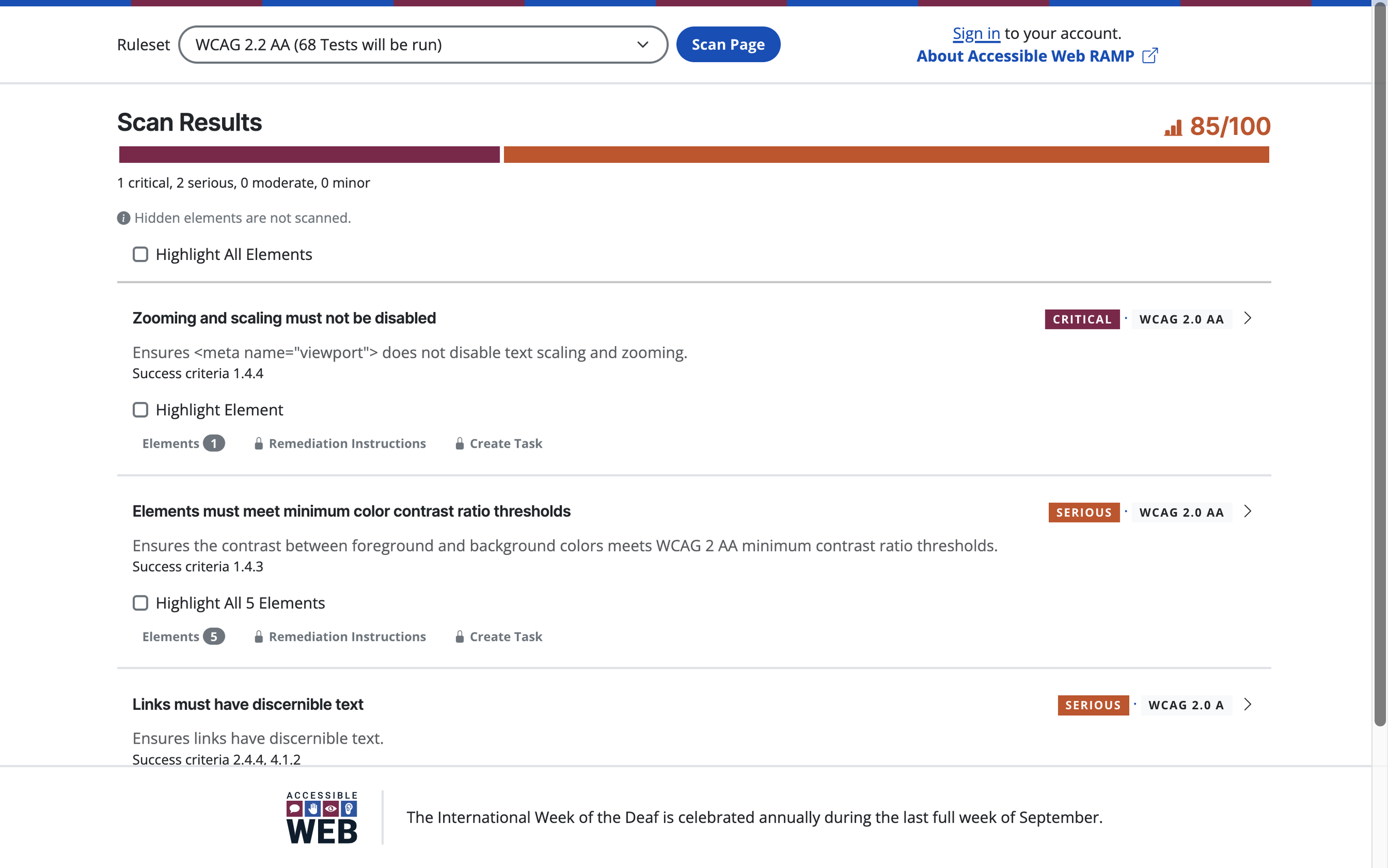
One of the tests for accessibility is the color-checking tool. The tool found some color contrast issues, and this report became very useful during conversations with the client.
User Flows
The Brilliant team collaborated with their development team to prepare user flows and provided excellent suggestions that required only minor adjustments based on best practices or additional context.
For instance, regarding messaging, my initial assumption was that there would be a system for direct communication between Brilliant and educators. However, implementing such a feature would require significant development and discovery time, which fell outside the project’s scope. Instead, the optimal solution was to enable the Brilliant team to display banners within the portal for their announcements, streamlining communication without extending the timeline.

One of the ways we communicated user flows was through the use of Notion. Where we wrote down the experience and collaborated as a team to align. Content blurred to protect proprietary material.
Visual Design Work
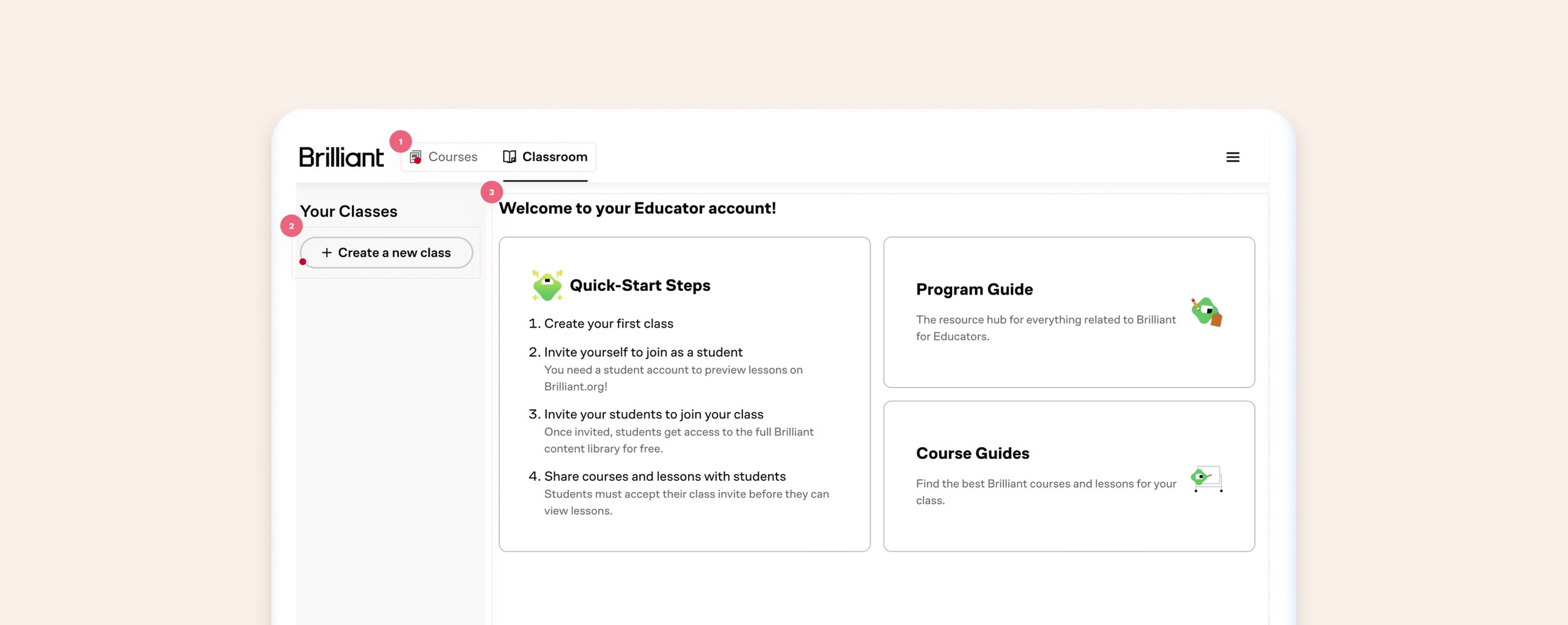
Old Dashboard
What worked: Educators can visit the dashboard and find their way to create new groups (classes), review their class and student progress, and browse through the hundreds of courses available through Brilliant.
What did not work:
Usability and accessibility issues: the home page is the second tab, which causes navigating confusion. Additionally, inactive tabs appear disabled due to the UI treatment.
Lack of focus: while there is content explaining next steps to the user, it’s unclear what is expected of them by having grey buttons on the side of the screen vs providing it more visual hierarchy.
Welcome and quick steps: take up the majority of the screen, giving the appearance that is the most important part of the screen.
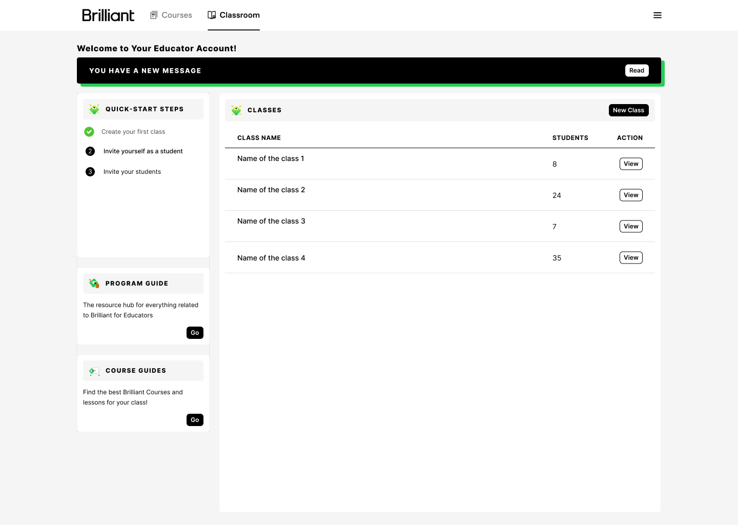
New Dashboard
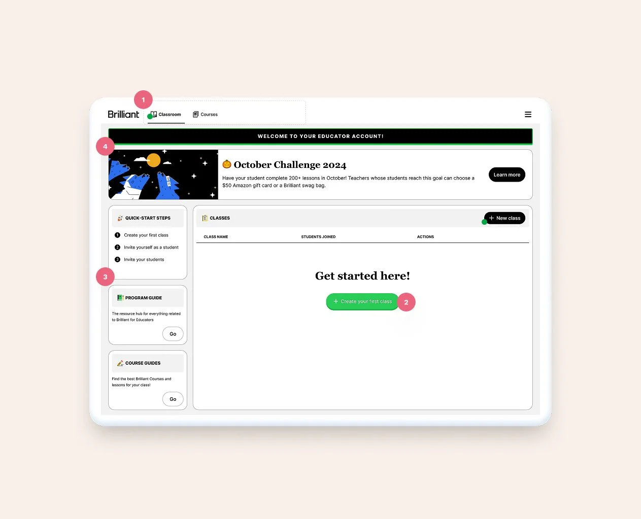
1. Updated tabs to follow the actual user flow + updated UI to avoid accessibility issues. 2. Added clarity to actions by moving CTAs strategically 3. Moved next steps and content to the left-hand side to give way to actions 4. Added a banner to the page to enhance Brilliant's communication with their users
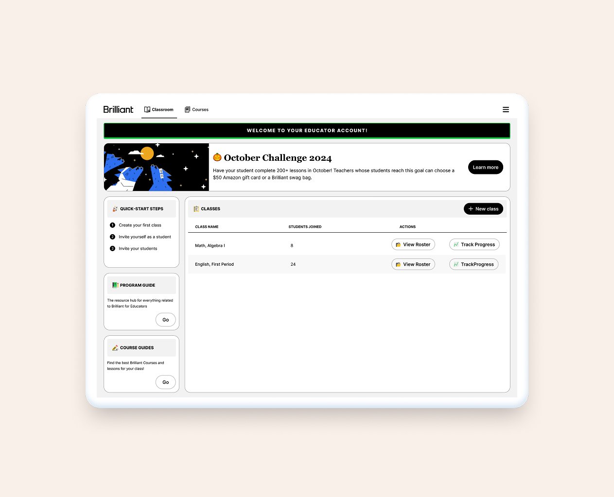
Once the user creates their first class, the green button disappears and the space turns into a table. In the future, there is also opportunity for adding stats to the screen.
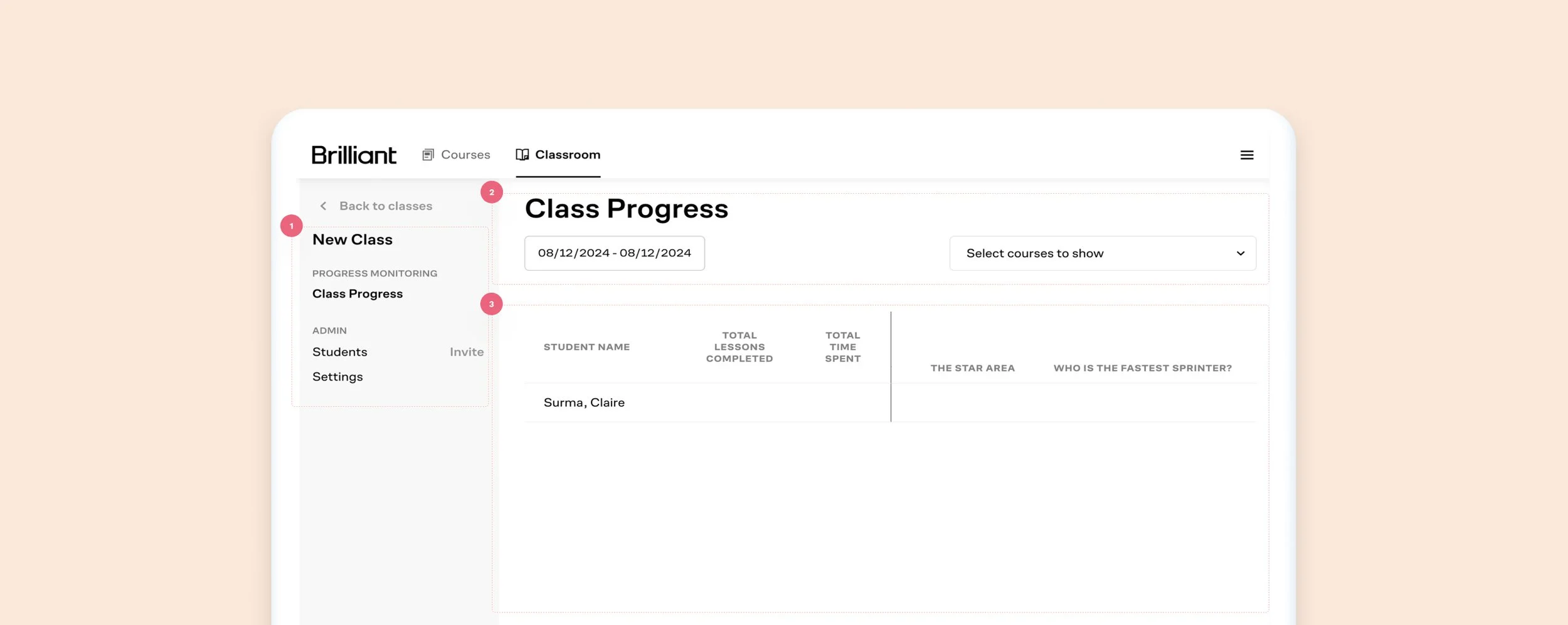
Old Class Progress Screen
What worked: Educators can review each student’s progress, invite students, and change settings.
What did not work:
The lack of color contrast between ctas, links, and labels can be confusing to the user
Misaligned items, a lot of unused space, no direction
Unclear information, wasted space, confusing UI
New Class Progress Screen
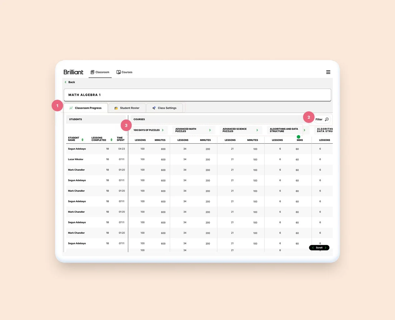
1. Breaking things into three separate tabs allow for better use of the space 2. Folded filters into it's own CTA and modal 3. Tightening up cells, and adding contrasting backgrounds between lines help the table read better
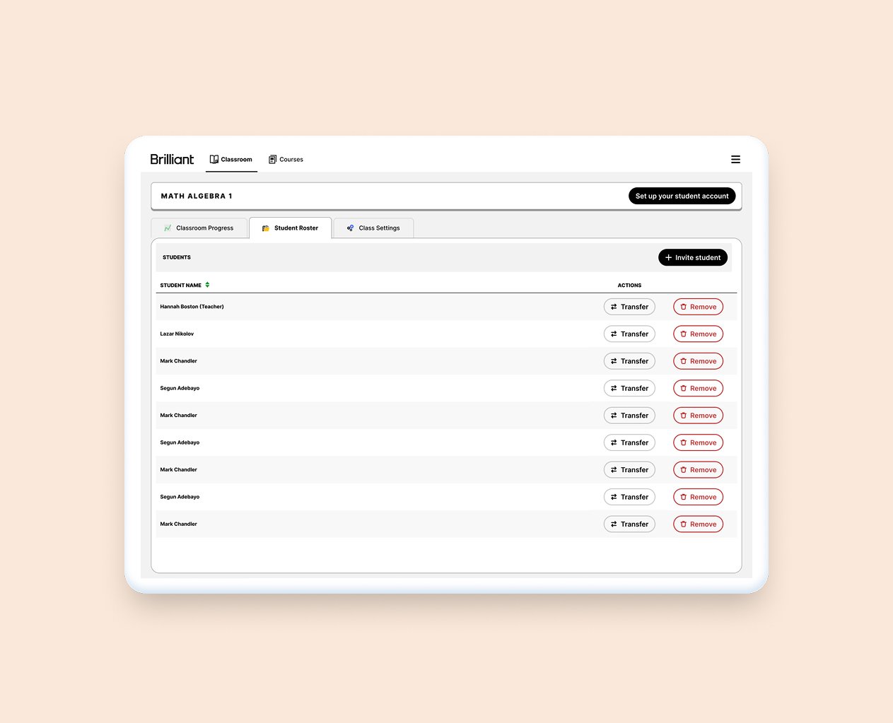
Moving the student management screen to it's own tab will allow for current and future uses
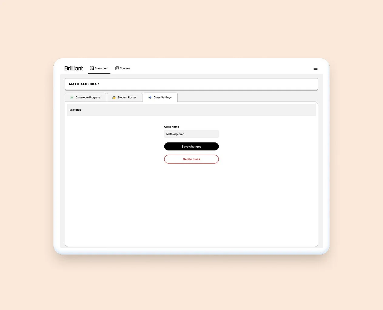
Moving the class management to it's own tab allows for a clearer experience, and space for future features
Iterations
-
![Iteration of a design]()
V1.
One of the earlier versions of this work. We added a few things after we received the branding files.
-
![Iteration of a design]()
V2.
I wanted to also show the team the value in adding more black to the UI from an accessibility perspective.
-
![Iteration of a design]()
V3.
We took what was loved from the first two versions, added mote branded UI, and this was the result.


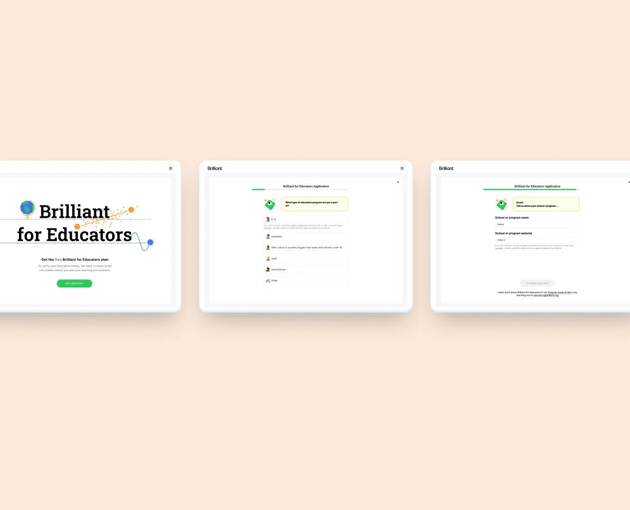
1. Landing page 2. Form Questions 3. Form Questions
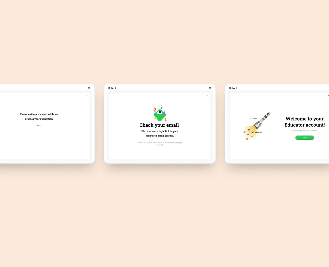
4. Confirmation 5. Completion 6. Log In

Progress Review Page

Class Page
Iterations
-
![Iteration of a design]()
V1.
I explored nesting Classes within the progress page, it made sense as the educator needs to have access to both, usually around the same time and for the same reasons.
-
![Iteration of a design]()
V2.
In this version I explored different UIs


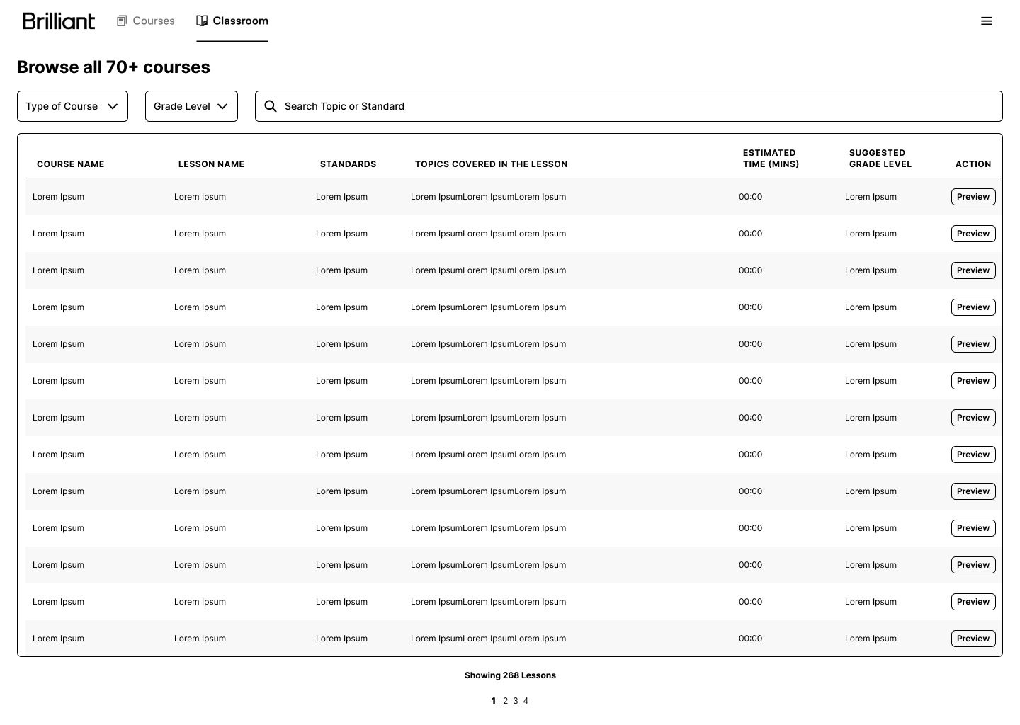
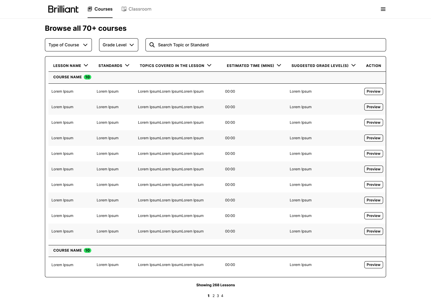
Courses Page.
Iterations
-
![Iteration of a design]()
V1.
One of the earlier versions of this work. The bare bones idea, simply display the data with a way to filter and search.
-
![Iteration of a design]()
V2.
In this early version, I explored how to group together the classes with the modules/
-
![Iteration of a design]()
V3.
In this instance, the same information is displayed, but with different UIs.
-
![]()
V4.
In this next to final version, I also included iconography that belongs to each category of course, and course themselves.


Let’s Talk!
I’m a designer, problem-solver, and storyteller with a love for color, whimsy, and thoughtful details. With experience in product, graphic, textile, and UX design, I create work that blends beauty with functionality. Whether designing patterns, packaging, or digital experiences, my goal is to spark joy and enhance everyday moments.