
Receipt Vault
From a blank brief to a live, AI-powered SaaS product brand, UX, and product design built from the ground up.
Services: Brand Identity, Product Design, UX Design, User Research
Deliverables: Logo system, color palette, brand guide, app UX flows, product screens
Industry: FinTech / Consumer SaaS
Status: Live at receiptvault.com
Intro
Receipt Vault came to me with an idea and a blank page. No brand, no product, no screens — just a concept: an app where people could organize their digital receipts. What started as a simple brief became one of the more interesting end-to-end design challenges I've worked on, because the most important design decision turned out to be one nobody had thought of yet.
The problem
The brief was deceptively simple: build an app for organizing digital receipts. But 'organize receipts' isn't a product — it's a category. Before I could design anything, I needed to understand why people actually needed this, what they were doing instead, and what would make them switch.
The client had an instinct about the problem but hadn't validated it yet. They'd come with a solution before they'd fully understood the need — which is one of the most common ways early-stage products go wrong. My job was to slow that down just enough to ask the right questions before building the wrong thing.

Early stage product flow ideation
Early stage product flow ideation

Early stage product flow ideation
Finding the real problem
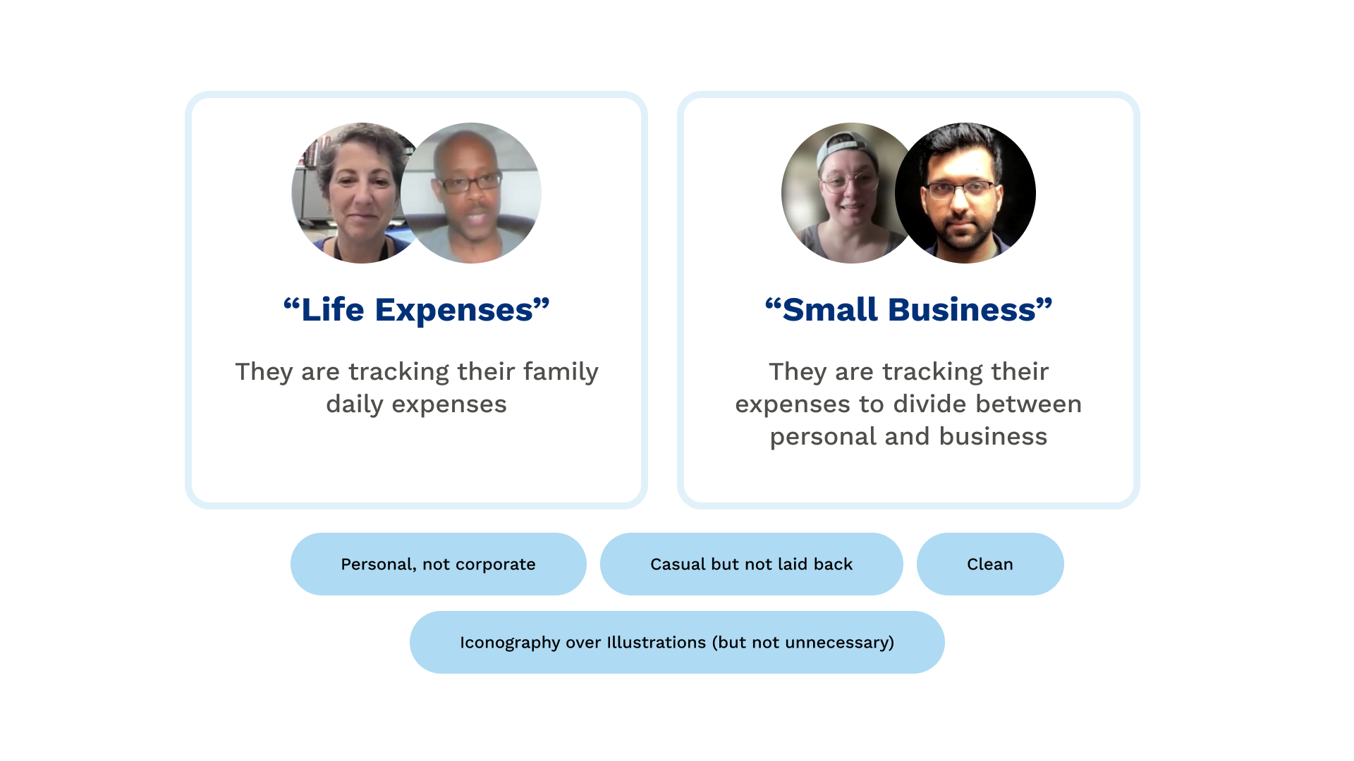
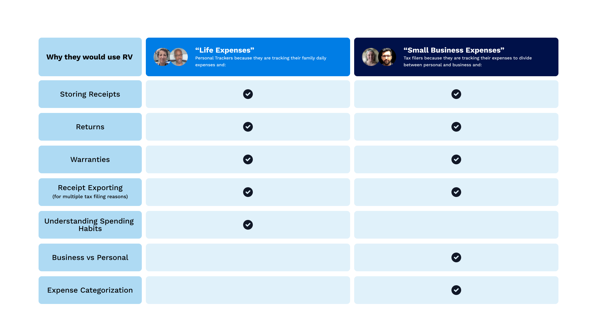
Before touching a single screen, I ran user research — 11 interviews across three distinct user groups: personal shoppers tracking everyday purchases, business purchasers managing work expenses, and individuals preparing for tax season.
Each group had a different relationship with receipts and a different reason they needed them. Personal shoppers cared about returns. Business purchasers cared about reimbursement and categorization. Tax filers cared about documentation and proof.
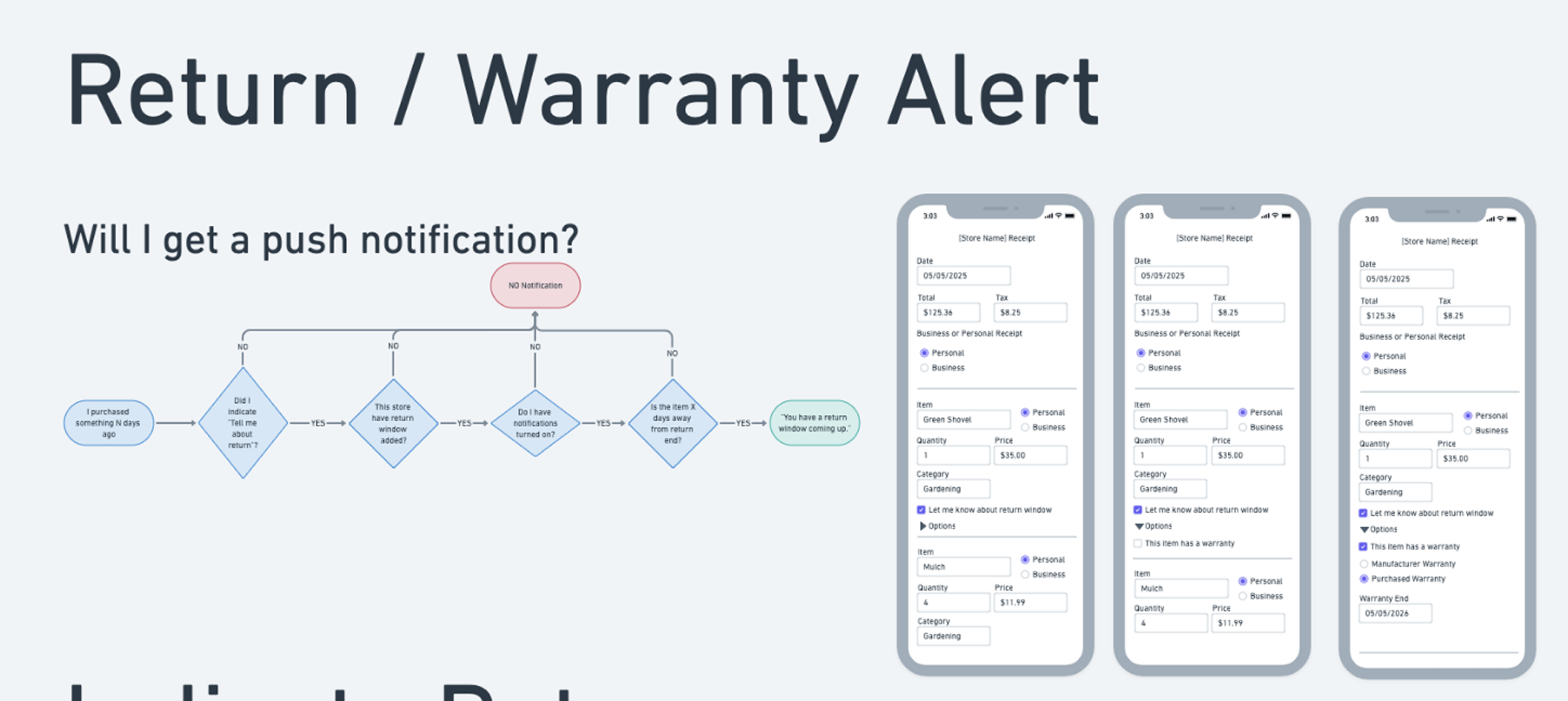
But the insight that changed everything came from across all three groups: the problem wasn't storing receipts — it was knowing what to do with them before they expired. Return windows. Warranty periods. Tax deadlines. People weren't losing receipts. They were losing track of time.
The feature that mattered most wasn't the vault. It was the calendar. Users didn't just need their receipts organized, they needed to know when those receipts were about to become worthless.
That research finding became the anchor for the entire product design. Return window tracking and warranty reminders went from a nice-to-have to a core feature — because without it, the product solved a storage problem nobody was urgently paying to fix. With it, it solved a money problem people felt every time they missed a return.
Slide prepared for the client’s pitch
Slide prepared for the client’s pitch
Building the brand
With the product direction established, I moved into brand — and the brief was clear: casual, simple, trustworthy. This wasn't a banking app. It wasn't trying to feel like enterprise software. It needed to feel approachable enough that someone would actually download it and use it in real life, while still feeling secure enough to trust with their financial records.
I explored multiple color directions — greens, which felt natural for a finance-adjacent product, and blues, which the client ultimately chose for their associations with security, clarity, and calm. I built a blue-led palette with a green accent that kept the financial credibility without feeling like a bank.
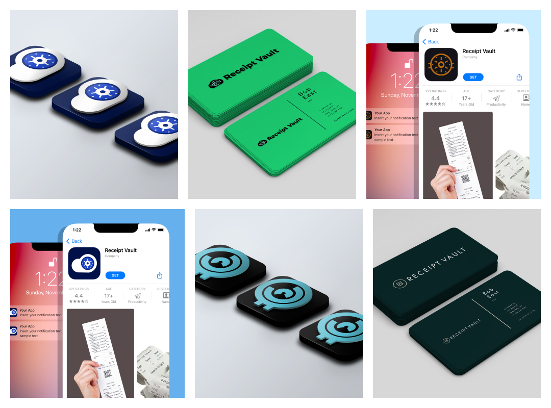
The logo followed the same logic: casual and simple, with vault and cloud motifs that communicated the core product promise — your receipts, secure and accessible — without being literal or heavy-handed. Quick-turn but intentional. The identity needed to work at app icon size as well as on a web page, so scalability was a constraint from the start.
Pieces taken from early stage branding
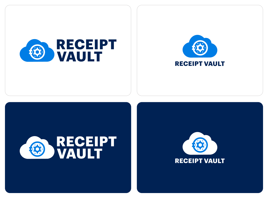
Receipt Vault Logos
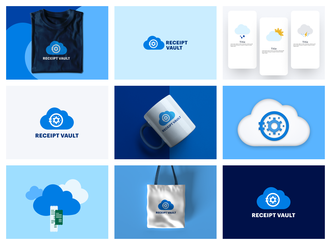
Branding examples
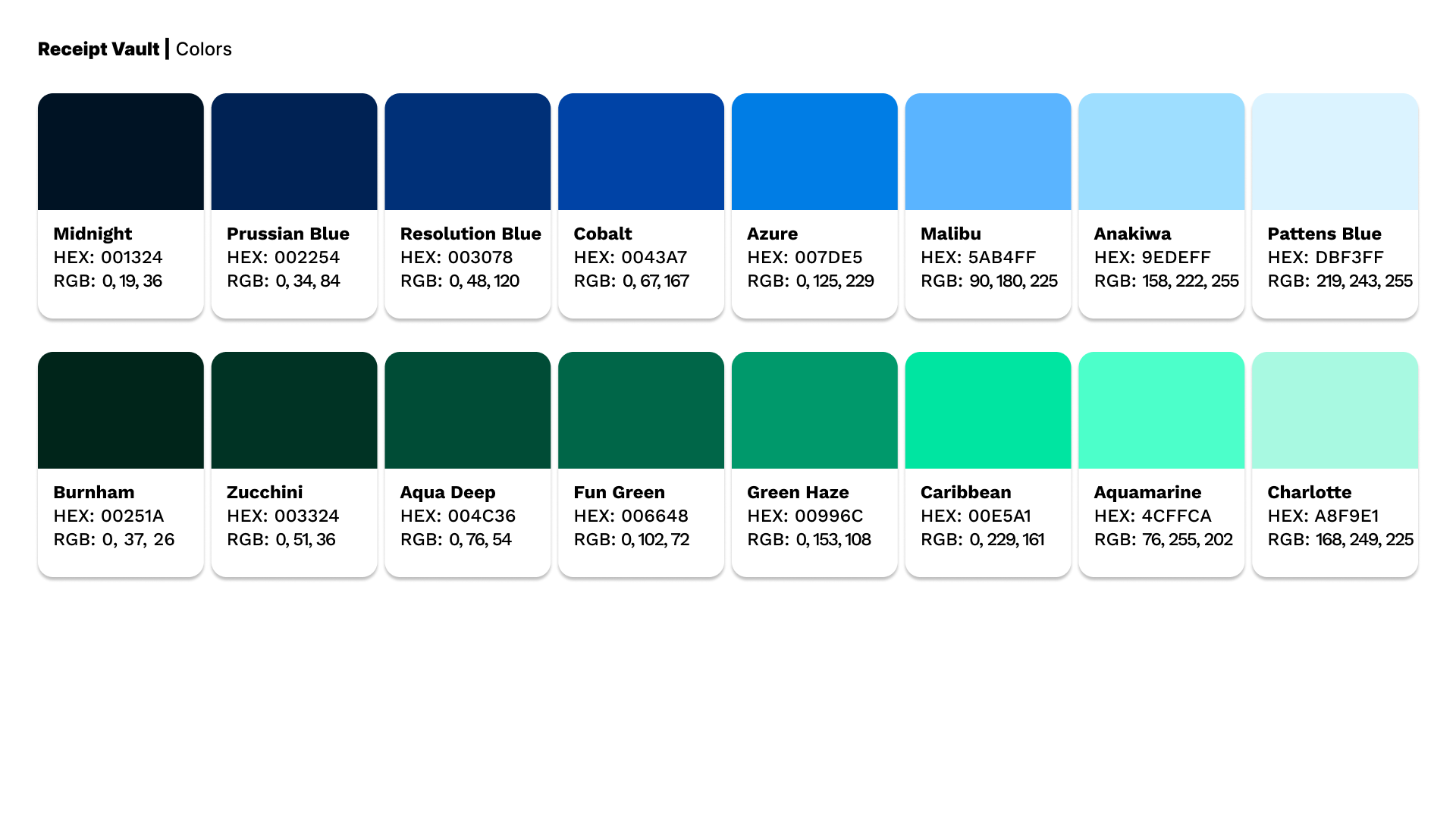
Branding Colors
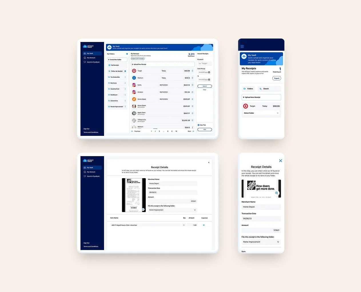
Designing the Product
The UX work was organized around the three user groups from the research phase — each with slightly different primary flows, but all sharing a core architecture: capture the receipt, categorize it automatically, surface it when it matters.
The return window calendar that emerged from the research became the feature I designed around most carefully. It needed to be proactive, not passive — sending reminders before windows closed, not just displaying dates after the fact. The data visualization for spending analytics needed to be readable at a glance for users who weren't financial analysts. The search needed to be fast and forgiving, because the moment someone needs a receipt is usually a stressful one.
I worked through user flows for each core journey — receipt capture (email integration, mobile scan, manual upload), organization (auto-categorization, custom folders), and retrieval (smart search, date-based browsing). Each flow was designed to minimize the number of steps between the user and the information they needed.
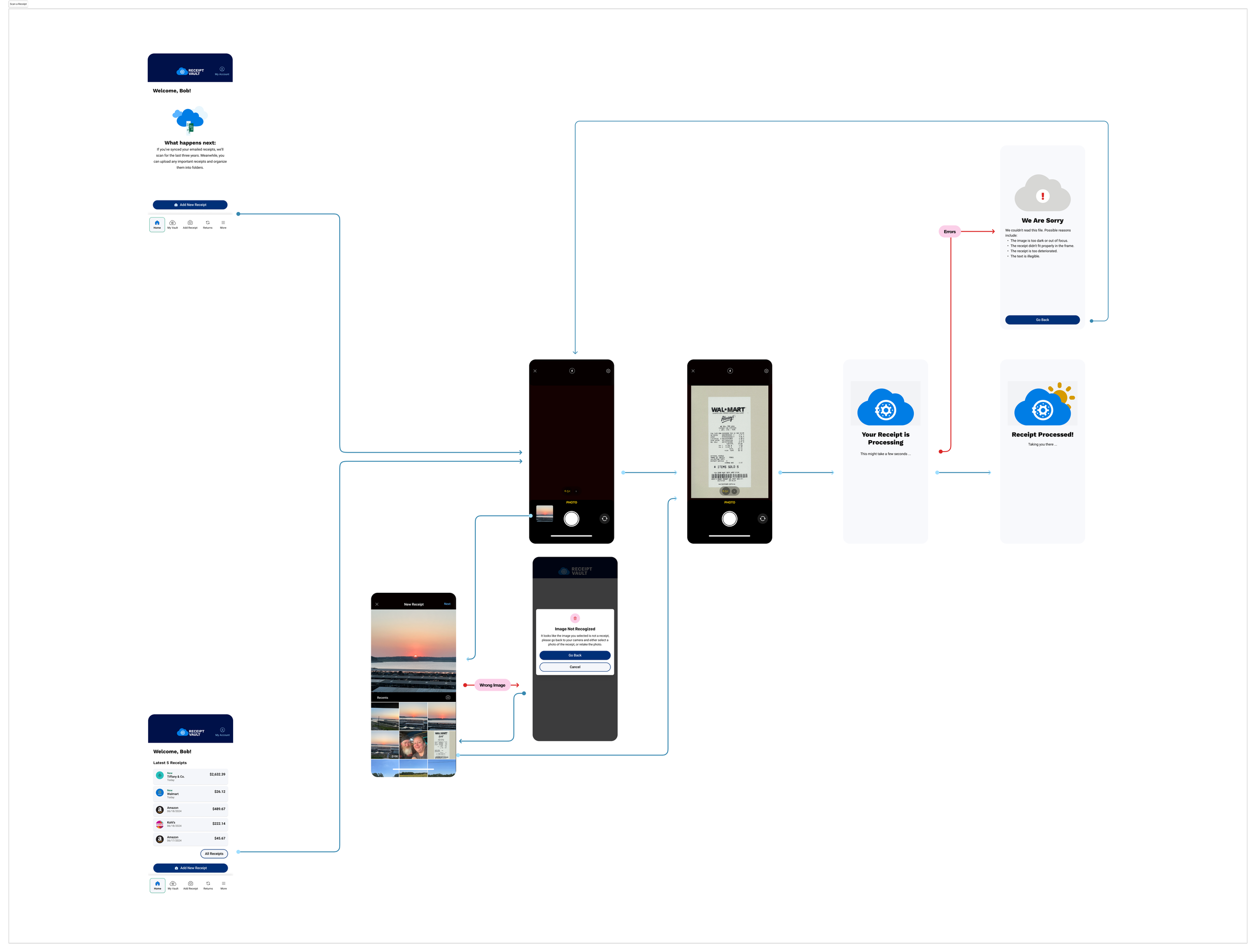
Example of user flows
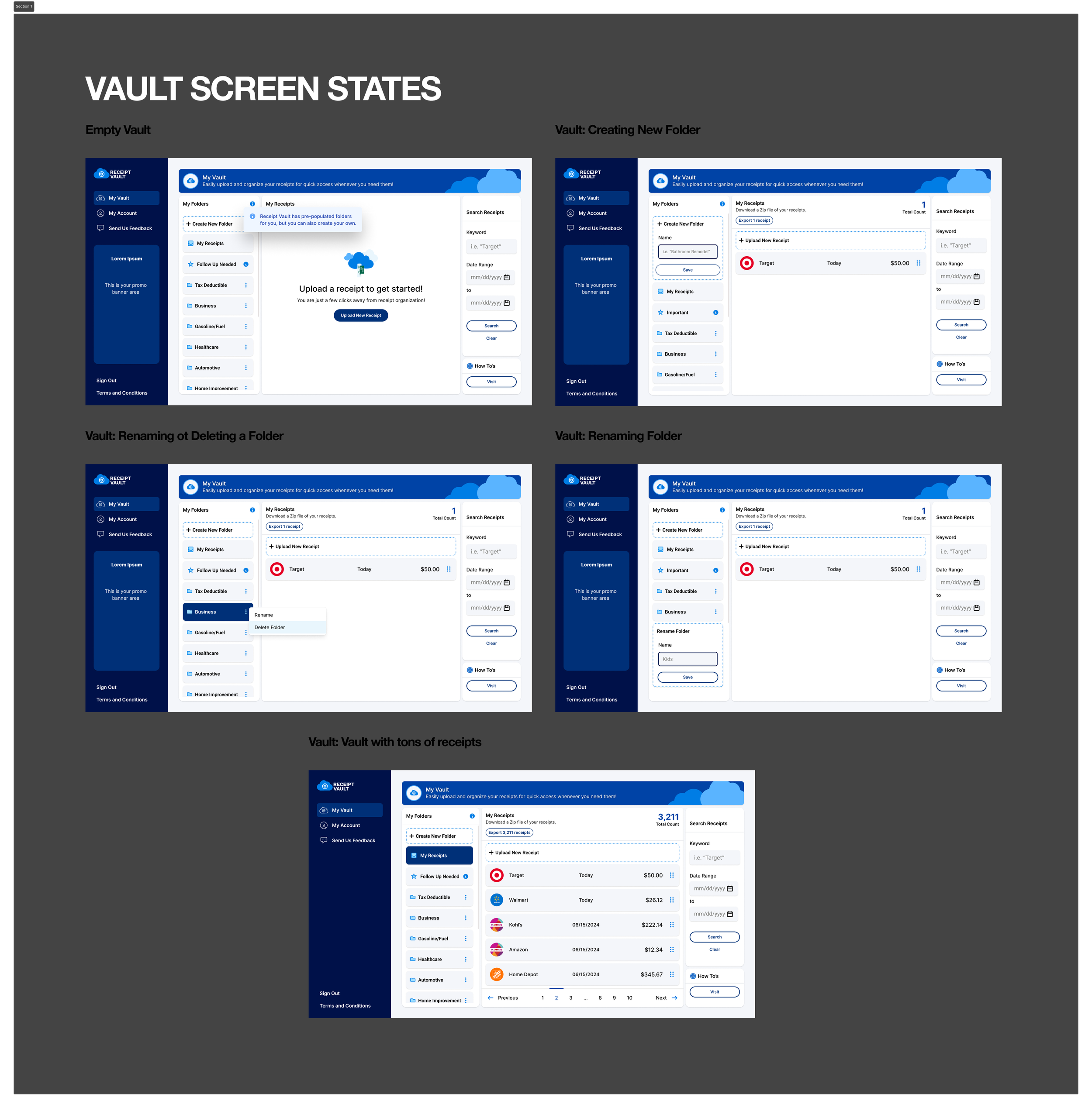
Various Vault States
The Outcome
Receipt Vault launched as a fully realized AI-powered SaaS product at receiptvault.com — with features that directly reflect the research: email integration that captures receipts automatically, mobile scanning for paper receipts, return window tracking with calendar reminders, spending analytics, and smart search across the entire receipt archive.
What started as 'an app for organizing receipts' became a product with a clear value proposition, a distinct brand identity, and a feature set shaped by what real users actually needed — not just what the original brief assumed they did.
The client came with an idea. They left with a product worth building.
Stats
0 → live Full brand and product design from blank brief to launched SaaS
11 user interviews Research that uncovered the product's most important feature
3 user groups Personal, business, and tax — each with distinct flows designed around their needs