What the Caribbean Taught Me About Designing for Delight

Pina Colada in a pineapple
Growing up in hotels gave me a design education no bootcamp offers. Here's what I took with me.
It's all about elevated joy.
One of my earliest behind-the-scenes memories is sitting on a chair in the corner behind a hotel reception counter in the Caribbean, watching everything unfold.
Guests would come through enormous glass doors and pass a piano bar where an artist worked on portrait sketches. The marble floors and dark wood of the reception counter drew them forward — and past it, you could see a wide hallway hosting a gift shop, a jewelry store, and a Cartier boutique. Above it all hung an enormous chandelier, and a staircase swept upward toward ballrooms that hosted events every night.
By the time guests reached the reception desk, they hadn't just arrived. They'd already had an experience.
My dad has always been the person who asks what's missing. The piano bar was a hit — but guests were having one drink and leaving for the pool. What would make them stay?
He brought in a portrait artist.
If you're having your portrait done — or watching someone you love get theirs done — you're going to sit there for a while. You're going to order more than one drink. You're going to listen to the piano player and have a genuinely wonderful time. And you're going to leave with a high-end, custom souvenir that no gift shop could sell you.
The piano bar stayed open. An artist stayed employed. The hotel made more money. The guests were delighted by something completely unexpected.
Will they come back? Absolutely they will.
That thinking — sure, people like this, but what if we could also do that — has never left me. When I'm working on a user flow or a brand touchpoint, I don't just want customers to feel like they're completing a task. I want them to enjoy the interaction. It's why you see me illustrating, animating, and building visual details into everything I do.
Elevating joy isn't decoration. It's strategy.
There are two places this shows up in your brand and product: how customers perceive you, and how they feel while working with you.
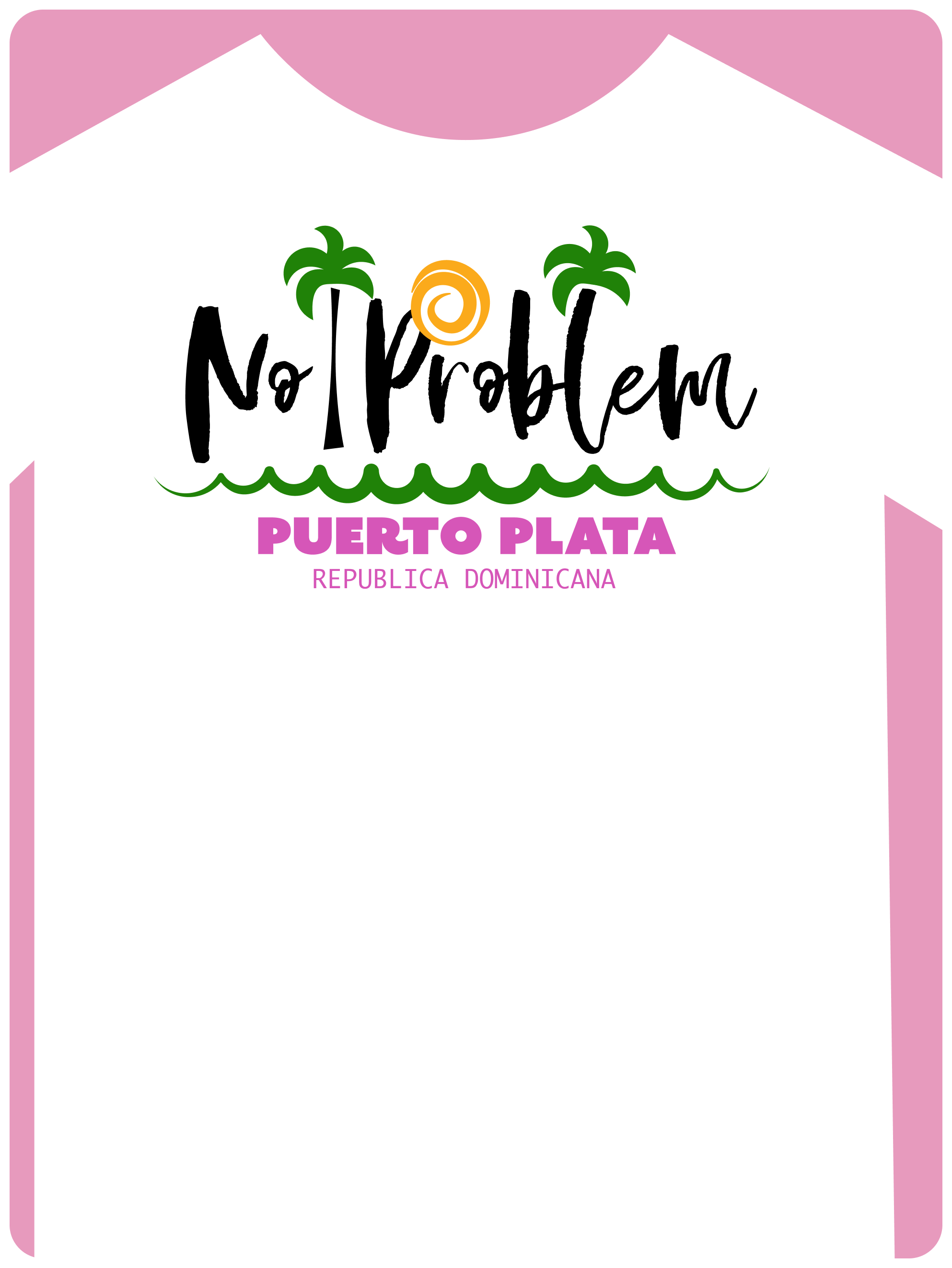
“No Problem” Dominican Republic Tshirt
How customers perceive you
Language
Speak to your customer in the words they actually use — not the ones that make you sound impressive.
On this blog, I assume I'm writing for founders building brands and products, and for other designers. So I say "startups" instead of "new businesses." I say "customers" instead of "users." That's intentional. I want every person reading this to feel like I wrote it for them specifically.
In the Dominican Republic, resorts used to sell shirts that read "Playa Dorada, No Problem!" I haven't been back in years, and I still think of white beaches and scooter rides when I read those words. That's language doing its job.
Imagery
Your visuals should be so consistent that customers recognize where they are the moment they see them — before they read a word.
On my site, every image is either an illustration I made in Illustrator or Figma, or a clean device mockup on a neutral background. That's not an accident. When you use too many different image styles — or too many fonts, or too many colors — customers experience cognitive overload. They can't settle in. The brand stops feeling like a place and starts feeling like a hallway with too many doors.
Think about Nike. Every photograph they publish feels like it was taken by the same person, of the same people, doing the same things. It wasn't. But it feels that way — and that feeling is brand recognition working exactly as it should.
Accessibility
Two things that lose customers before they've read a single word: a page that takes too long to load, and visuals that are too hard to read.
When your site is slow, you're telling customers their time doesn't matter. When your graphics fail contrast standards, you're telling them you have a lot to say but aren't particularly interested in whether they can hear it.
Apple is the standard bearer here. Their website updates are packed with incredible effects that would break most browsers — but they have the engineering resources to make sure every page still loads fast and reads clearly. You don't need Apple's budget to adopt Apple's principle: accessibility isn't a constraint on good design. It's part of what good design means.
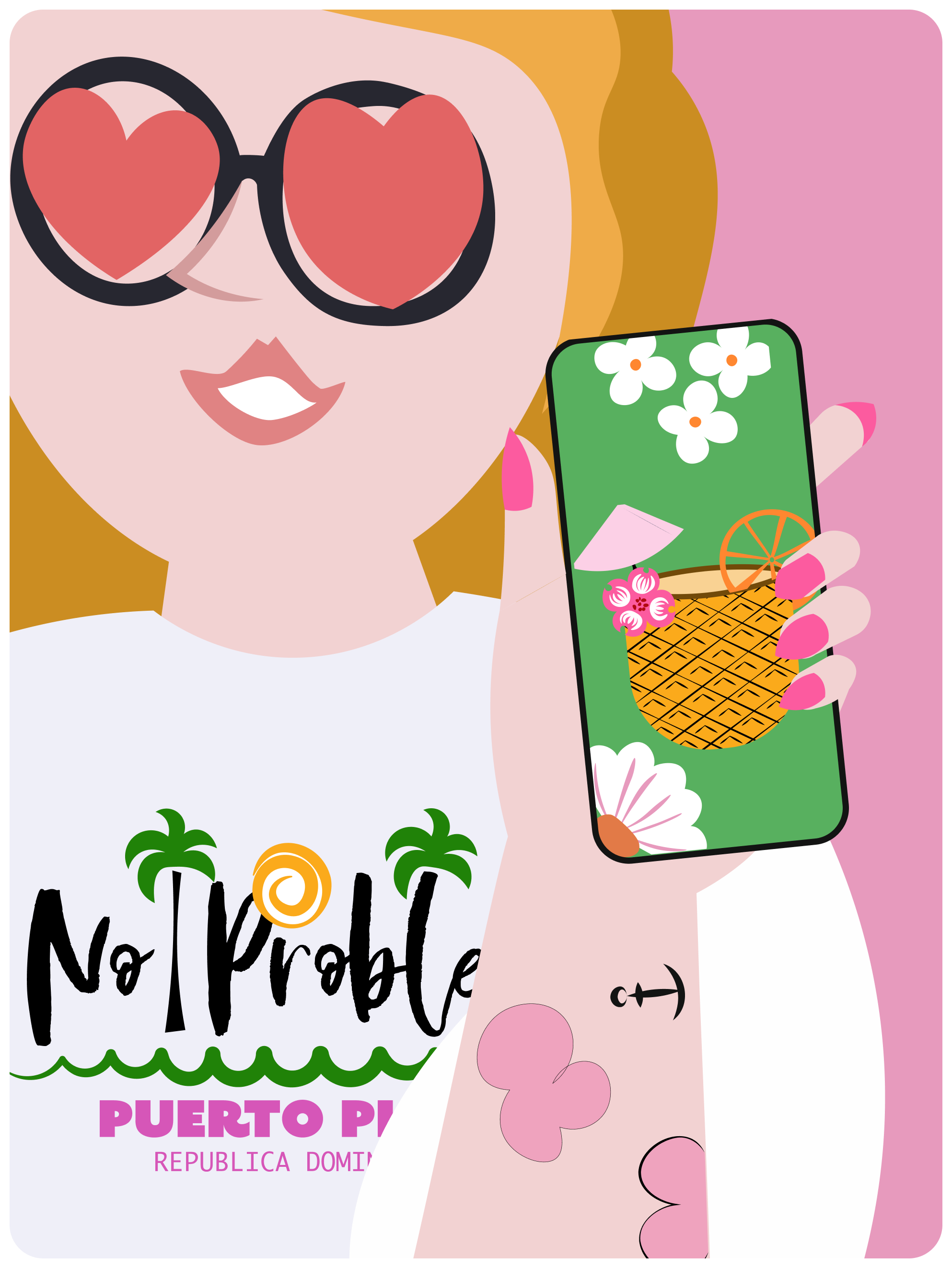
Me sharing the image of the pineapple on my phone
How customers feel while working with you
Listen more than you talk
The best products don't solve the founder's problem. They solve the customer's problem — which is usually related but rarely identical. Understanding how other people experience the same frustration you had will not only help you build something more useful, it will give you ideas you never would have found on your own.
Be transparent, not scary
"I don't know" followed by silence is not an answer. "I don't know right now, but I'll find out" is. Your customers need to trust that you're as invested in their questions as they are. A genuine "I'll get back to you on that" builds more confidence than a confident answer that turns out to be wrong.
Always shoot to delight
Do the things. Then think about what you could do to make the things better.
Does a piña colada taste different served in a cup versus a hollowed-out pineapple? Probably not. But the pineapple version gets photographed, posted, and envied by everyone who sees it online. It becomes a reason someone else books the trip.
A hotel suite with clean beds is nice. A hotel suite with clean beds, a swan folded from towels, and a mint chocolate on the pillow is something guests talk about for years.
A brand that consistently finds those moments — the unexpected details, the small elevations, the things nobody asked for but everyone remembers — will always go further than one that just delivers what was promised.
That's what my dad understood in that piano bar.
That's what I think about every time I open a new project.