Design Systems: The Secret Ingredient Behind Every Brand You Recognize
Illustration of me working on a design system in figma, drinking a Starbucks White Mocha with my name misspelled.
Whether you're a founder or a designer, here's what design systems actually are, why they matter, and how they work in both branding and product design.
There's a reason your Starbucks order tastes exactly the same whether you're in Miami, Seattle, or Tokyo.
It's not magic. It's systems.
While Starbucks uses generic ingredients for some things — fresh milk, seasonal add-ons — their syrups, coffees, and sugars all come from the same centralized source. Every location receives the same ingredients, prepared the same way. Because when you order a Mocha, you expect it to taste like the Mocha you had last time. And if it doesn't, you notice.
That expectation is what they're protecting. Design systems do exactly the same thing.
What a design system is
A design system is a library of pre-decided visual and interactive elements that ensure every touchpoint of your brand or product looks and feels like it came from the same place — because it did.
Think of it as the ingredients your team must always use. Not suggestions. Ingredients.
Design systems in branding
In branding, a design system captures everything visual: colors, fonts, layouts, image styles, illustration guidelines, spacing rules. All of it pre-selected, documented, and stored in a shared library that any designer — or non-designer — can pull from.
The goal is simple: when someone sees anything your brand produces, they should recognize it as yours before they read a word.
I do this on my own blog. Every illustration I publish is created by me using the same color palette and the same floral motifs, over and over. That's intentional. The hope is that eventually, when you see one of those illustrations somewhere online, you'll think — without even checking — "that's the cookie design lady." That's brand recognition working exactly the way it should.
Design systems in product design
In product design, a design system does everything a brand system does — and then goes further.
Beyond colors and fonts, a product design system also defines interaction elements: buttons, links, icons, input fields, modals, navigation patterns, and how all of those behave together. What does a button look like when it's active? When it's disabled? When you hover over it? What's the animation? What's the border radius?
These decisions get made once, documented clearly, and applied consistently across every screen in the product.
The reason this matters for your customer: when every interaction follows a familiar pattern, they stop having to think about the interface and can focus entirely on what you're offering. Consistency removes friction. Friction is where you lose people.
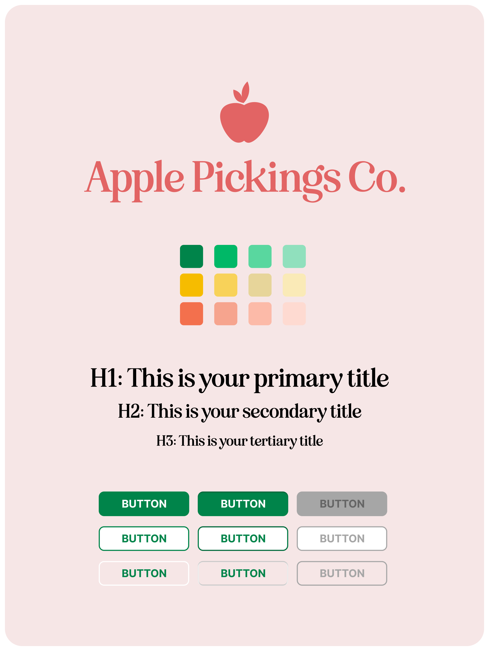
Super oversimplified design system example
What this looks like in practice
Larger companies typically maintain their own design systems — sometimes enormous ones — built in tools like Figma or coded component libraries hosted on platforms like Storybook.
The largest design system I've personally worked on was for The Wall Street Journal. Multiple Figma files, hundreds of components, each with multiple variants for every possible state and context. A system built to ensure that everything across their digital products — from the homepage to a subscriber's account settings — felt coherent, intentional, and unmistakably WSJ.
You don't need to be the Wall Street Journal to benefit from this thinking. Even a simple, one-page brand guide with your colors, fonts, and image guidelines is the beginning of a design system. It just scales from there.
What a design system typically governs
Buttons — appearance in every state: default, hover, active, disabled, including colors, font weight, border radius, and any animations
Typography — every font in use, when to use each one, sizing, line height, spacing, and allowed combinations
Color — every brand color with its hex code, and where each one is used
Spacing — the rules for how much space lives between elements, creating rhythm and breathing room
Shadows and elevation — how depth is communicated visually
Borders and border radius — the rules that make your corners feel consistent, whether sharp or rounded
These elements combine into reusable components — buttons, cards, navigation bars, form fields — that designers and developers pull from every time they build something new. Same ingredients, every time.
Why this matters for you
If you're a founder: a design system is what makes your brand scalable. Without one, every new designer you bring in starts from scratch and makes slightly different choices. With one, the brand stays consistent whether you're designing it yourself or handing it to an agency.
If you're a designer: building even a minimal design system for your clients is one of the highest-value things you can deliver. It's the difference between handing someone a finished painting and handing them a palette they can use to keep painting.
The Starbucks Mocha tastes the same everywhere because someone made a system. Your brand can work the same way.