
Typography for Startups: How to Choose Fonts That Work

Illustration of a font
The rules are simpler than you think, and breaking them is expensive
Typography is one of those brand elements that people underestimate until they see it done badly. One mismatched font pair can make an otherwise polished brand look amateurish. The right combination, applied consistently, makes everything feel more intentional — and intentional is the thing brands are always trying to be.
Here's a practical guide to making font decisions that hold up.
The one-two system
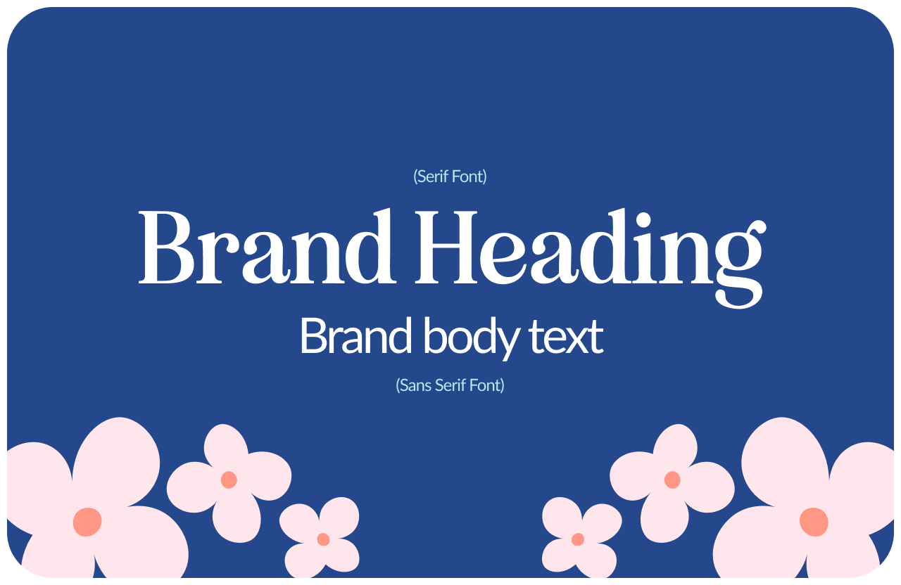
For almost every startup brand, you need exactly two fonts: one for headings and one for body text. That's it. Not three. Not four. Two.
The heading font carries the personality. It's what people notice first, what sets the tone, what communicates whether this brand is formal or playful, bold or refined. It can be more distinctive, more expressive, because it's used in larger sizes where it can hold its own.
The body font does the work. It needs to be extremely readable at small sizes across all devices and contexts. This is not the place for personality — it's the place for clarity. A poorly chosen body font is one of the fastest ways to make a website feel difficult to read without knowing why.
Branding Fonts
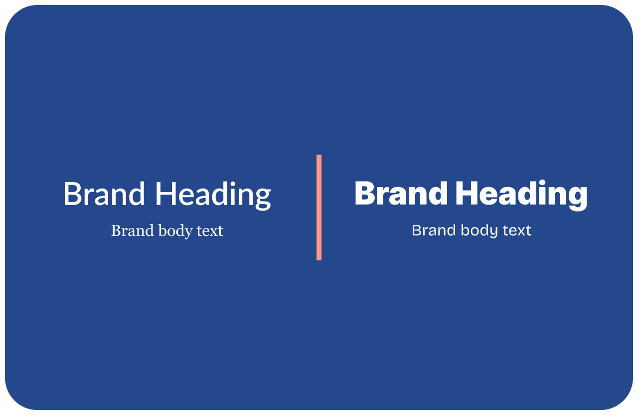
How to pair them
The classic pairing principle: contrast without conflict. If your heading font is serif, your body font is usually sans-serif, and vice versa. If both are sans-serif, they need to feel different enough in weight and proportion that there's clear hierarchy.
A few pairing principles that work reliably: serif heading with clean sans-serif body (classic, versatile, hard to get wrong). Geometric sans-serif heading with humanist sans-serif body (modern, clear, works well for tech). Display or editorial heading with neutral body (high personality, high risk — works when it works, distracting when it doesn't).
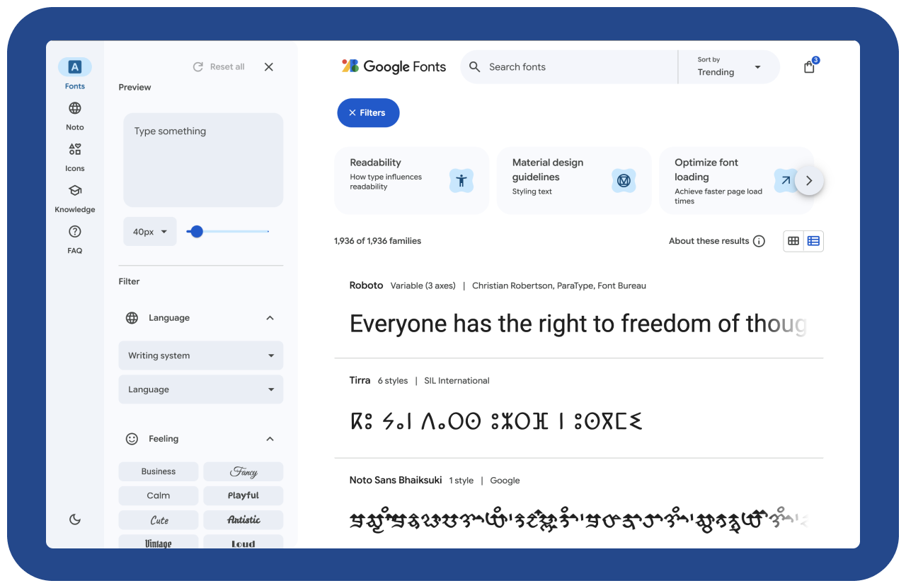
Google Fonts has a suggested pairings feature that's genuinely useful. Start there if you're unsure.
Font Pairings
The practical requirements
Whatever fonts you choose, they need to be available in every format you'll use them: web (WOFF2), print (OTF or TTF), and presentations (installable on your team's computers or available in Google Slides).
Google Fonts solves this for most cases — free, web-optimized, widely compatible. If you choose a premium font, make sure you have the right license for the usage (web use, app embedding, and commercial use are often separate licenses).
Check that your chosen fonts include all the characters you need — especially if you have team members writing in languages with accents or special characters.
The consistency rule
Once you've chosen your typography, use it consistently everywhere. Website, pitch deck, proposals, social posts, email newsletters. The same two fonts, in the same hierarchy, every time.
Typography consistency is one of the quietest brand differentiators. Nobody consciously notices when it's right. Everybody subtly notices when it's not — the deck that uses a different font than the website, the social graphic that pulled from a different system.
Two fonts, used consistently, will always outperform five fonts used inconsistently. Always.
Google Fonts