
The 5 Brand Assets Every Startup Needs Before Launch
Branding Examples
Not nice-to-haves. The actual minimum viable brand.
There's a version of brand completeness that costs fifty thousand dollars and takes six months. That's not what we're talking about here.
This is about the minimum viable brand — the five assets that, if you have them in good shape before you launch, give you a foundation to build everything else on. Not a placeholder. Not a first draft. A real, strategic starting point.
Here's what that looks like.
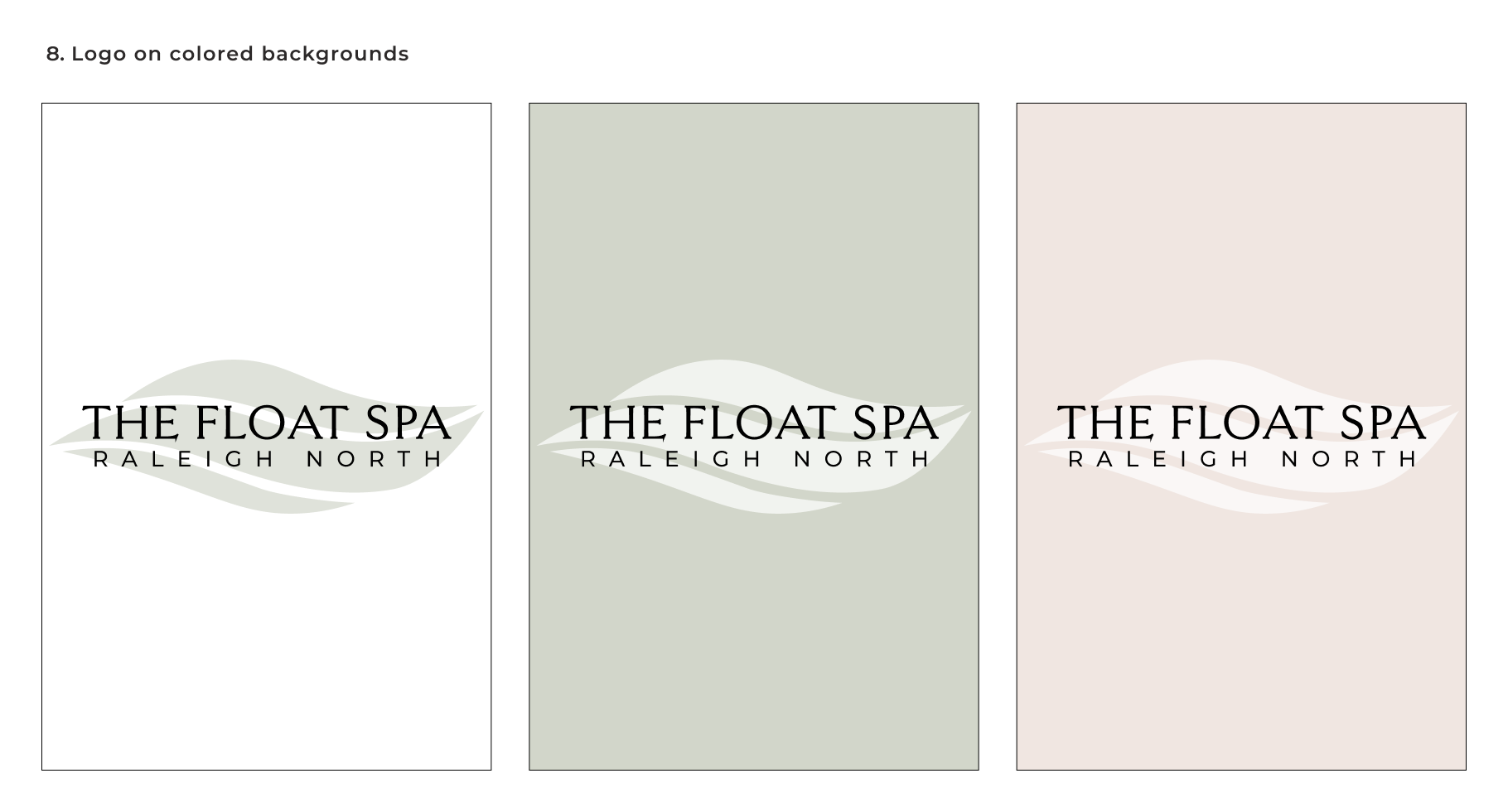
Logo System for Float Spa Raleigh
1. A logo system (not just a logo)
One primary logo plus at least two variations: a horizontal lockup and a mark or icon that works at small sizes and on dark backgrounds. Why three? Because your logo will appear in contexts you haven't thought of yet — a small profile picture, a dark-mode email header, a favicon — and a single version will break in at least one of them.
Your logo doesn't need to be the most creative thing ever conceived. It needs to be distinct, scalable, and appropriate for your industry. Simple and right beats clever and wrong every time.
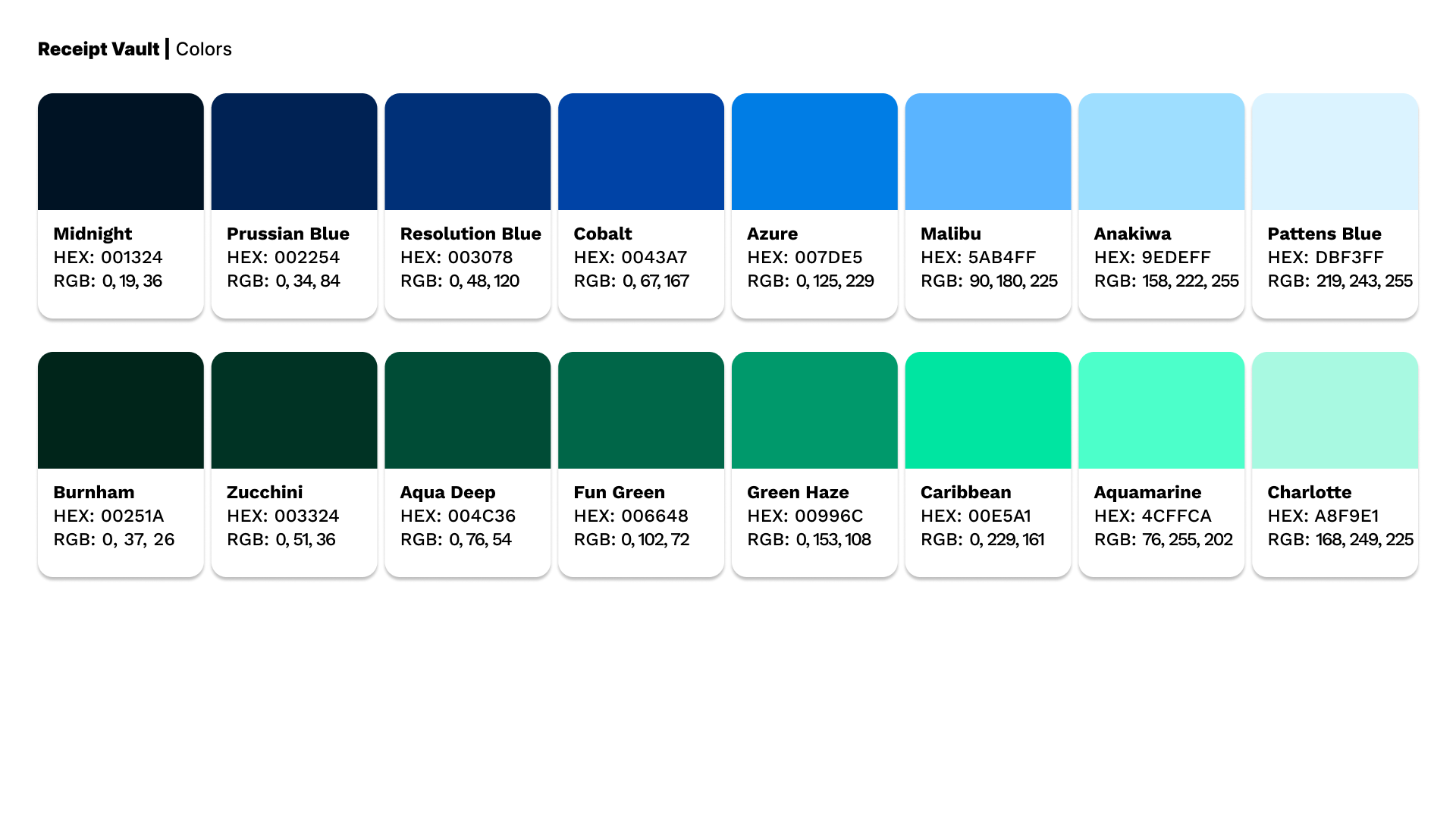
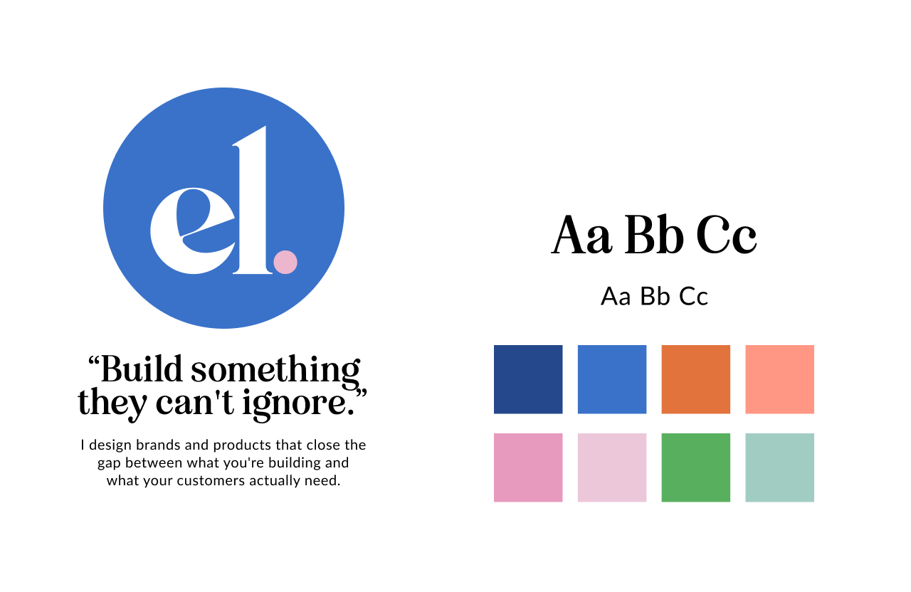
Color Palette for Receipt Vault
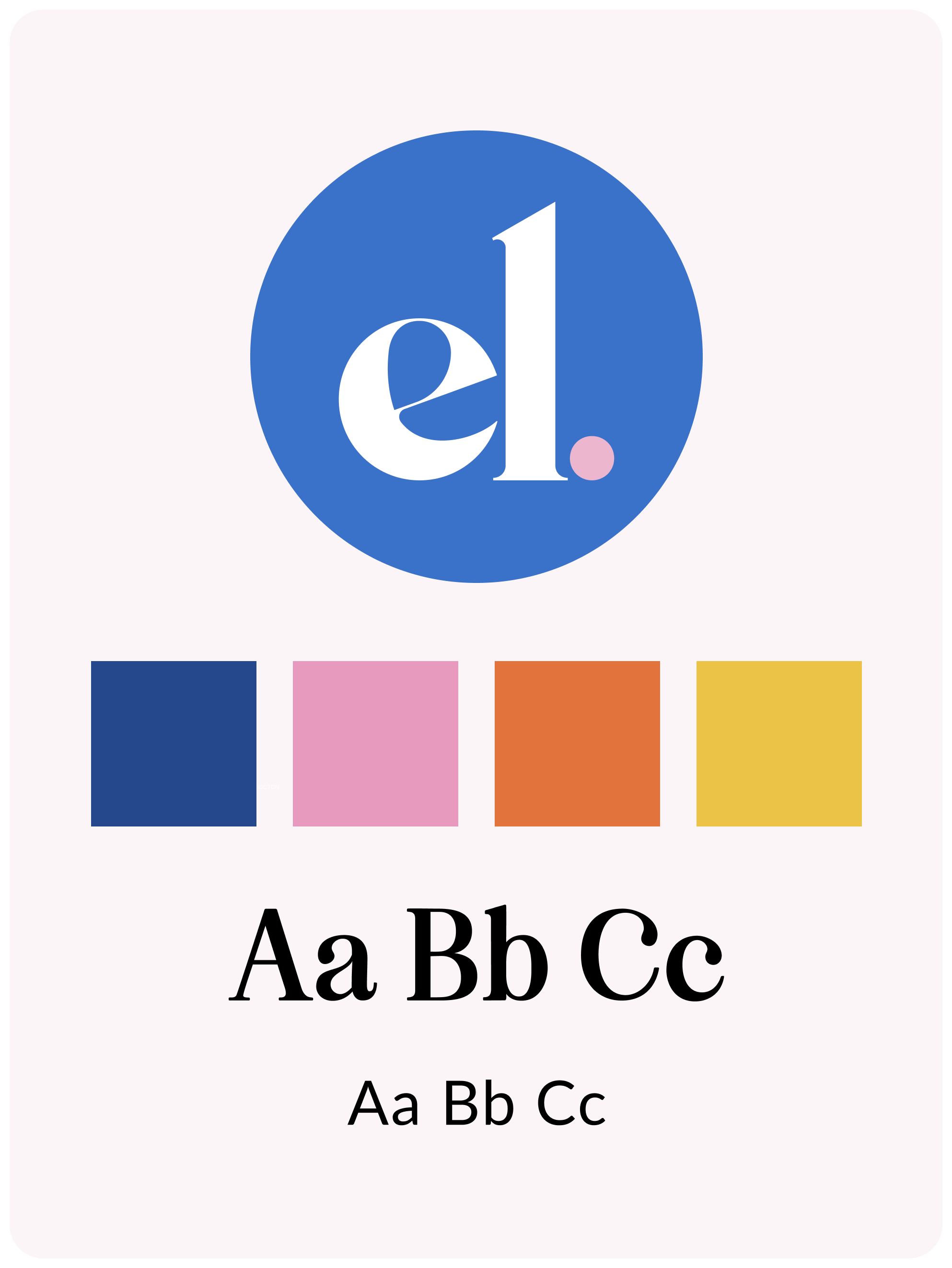
2. A defined color palette with hex codes
Two to four colors, documented with exact hex codes. A primary color, a secondary, a neutral, and optionally an accent. Each one with a defined job — where it appears, what it emphasizes.
Without hex codes, your brand colors drift over time as different people make slightly different choices. The blue on your website becomes a slightly different blue on your pitch deck. Small individually, but cumulative over time and noticeable to the people you're trying to impress.
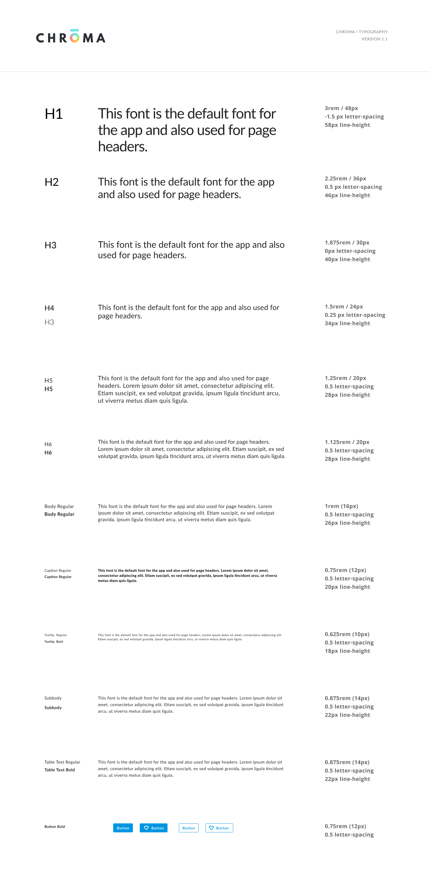
Typography for Chroma Design System
3. A typography pairing
One heading font, one body font. They should be compatible, readable, and available in the formats you need — web, print, presentations.
If you're using Squarespace, Webflow, or a similar platform, stick to web-safe fonts or Google Fonts for the body at minimum. Custom fonts are great but they need to be implemented correctly everywhere or they become another inconsistency point.
The test: print a page of your website. Open your pitch deck. Open your last email newsletter. Does the typography feel like it belongs to the same brand?

My home page
4. Core messaging, three pieces
Your one-sentence description of what you do and who it's for. Your value proposition — the specific outcome you deliver. Your elevator pitch — two to three sentences that you can say out loud without sounding like you're reading from a script.
These three pieces of messaging become the copy on your homepage, the text in your LinkedIn bio, the first paragraph of every proposal you send. Get them right and everything downstream gets easier.
Get them wrong and you'll be rewriting them constantly, which means your brand voice never sounds consistent.
5. A one-page brand guide
Everything above, on one page. Logo files and usage rules. Color palette with hex codes. Font names and where to use them. Three to five words describing your brand voice. What to do and what not to do.
This document gets shared with every designer, every copywriter, every social media manager who touches your brand. It's the thing that makes your brand reproducible without you. Without it, maintaining consistency requires your personal involvement in every decision — which doesn't scale.
One page. Keep it simple. Update it when things change. Share it freely.