
Accessibility in Brand Design: The Non-Negotiable Your Brand Might Be Failing

It's not a nice-to-have. It's a basic requirement, and most brands are getting it wrong.
Here's something I care about that doesn't always get covered in brand design content: accessibility. Not as a box-ticking exercise. Not because it's legally required in many contexts. Because a brand that can't be read by a significant portion of your audience isn't fully working.
About 1 in 12 men and 1 in 200 women have some form of color vision deficiency. Around 2.2 billion people worldwide have some form of visual impairment. If your brand's legibility depends on color contrast that fails accessibility standards, you're not reaching all of them.
Here's what to check and how to fix it.
The contrast ratio rule
WCAG AA — the most commonly referenced accessibility standard — requires a minimum 4.5:1 contrast ratio between text and its background. For large text (18pt or larger), the minimum is 3:1.
This sounds technical but it's easy to check. The WebAIM Contrast Checker is free and takes thirty seconds. Plug in your text color and background color. If you fail, adjust until you pass.
Common failure modes: light grey text on white backgrounds (extremely common in "clean" design trends), text overlaid on images without enough contrast, brand color combinations that look great visually but fail the ratio test.
A color palette that you love but that fails accessibility isn't finished yet.
Don't rely on color alone to communicate meaning
If your dashboard uses red and green to indicate positive and negative states, someone with red-green color blindness (the most common form) cannot interpret that information. This is a functional problem, not just an aesthetic one.
The fix is to never use color as the only indicator. Use color plus an icon. Color plus text labels. Color plus shape. The information should be understandable even in grayscale.
Test it: take a screenshot of your brand materials and convert it to grayscale. Does everything still make sense? Can all the important information still be read?
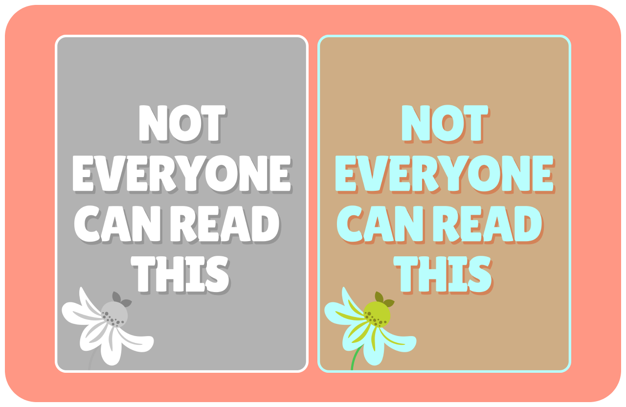
Comparison of color contrast issues
Typography accessibility
Font size matters. 16px is generally considered the minimum for body text on screen. Smaller than that and you're asking a significant portion of your audience to work harder to read you.
Line length matters. Text that runs more than 70–80 characters per line becomes hard to track for many readers. On wide screens, constrain your text to a readable column width.
Line height matters. Body text needs room to breathe — 1.5 to 1.6 times the font size is a reliable starting point for readable line height.
These aren't arbitrary design rules. They're based on how human vision actually works.

Example of test that’s too small
Why this is a brand decision, not just a technical one
A brand that's difficult to read says something about the brand. It says: we didn't think carefully about our audience. We prioritized aesthetics over usability. We didn't consider that not everyone sees the way we see.
That's a brand message nobody intends to send. But it's one that some brands are sending right now.
Accessible design is thoughtful design. It's the mark of a brand that considered its audience carefully enough to make sure everyone can actually access it. That's a value worth building into your brand from the beginning — not retrofitting after the fact.